Sneak Peak at Illustrations for Up-Coming Children’s Book


A while ago, my wife Gwynne wrote a children’s book that has been waiting for me to do the illustrations.  I was able to get a start this week, and I have been thoroughly enjoying it!


At this point, I have about half of them done – so I will follow up in my blog with the full text of the story along with the illustrations when it is all complete.  For now, I have posted the illustrations I have done below.  The basic story is about a girl and her father experiencing everyday life while the girl starts to tell fanciful stories.  For example, in the first illustration, the father and daughter are having a picnic on their front stone stoop looking at the garden when the little girl starts her story with: “Once upon a time there was a butterfly, and a balloon, and a flower as fragile as glass”. The idea of the book is to open up the rest of each story for the readers to make up on their own.


Enjoy!

A Painting of a Special Place

In addition to finding new people to collaborate with through BlackBeak studios, I have also been fortunate enough to do some work with friends and family.


My latest piece is for my brother Matt, who asked me to honor a special place with a painting.  As I had mentioned in a previous post, my brothers and I do an annual camping trip in the Adirondacks. Every year we camp on a little lake called Huntley Pond and every year we hike to a spot on the Hudson River called the Blue Ledge.  Depending on the time of year and weather, we may jump in – but usually, we just enjoy the beauty of the place and throw sticks for Matt and/or Ian’s dogs to fetch.


This tradition started 20 years ago with my father and my older brother Matt (my younger brothers Danny and Ian were too young to join back then).  20 years ago we camped on Huntley Pond and hiked to the Blue Ledge.  The first time we made the trek to the Blue Ledge, we didn’t come prepared for the swim – but it was a hot day and the river was calling us in.  Since nobody was around (we were in the middle of nowhere, after all), we stripped down to our underwear and started to head in to the water with our dad in the lead. 


Which leads us to the first of many memories of this trip and this spot.  As our dad waded in to his waist, a raft full of about 15 people came around the bend.  Matt and I had not jumped into the water yet, so we quickly retrieved our shorts.  Our dad was in deep though, and – all while giggling – he made for the shore, soaking wet in his underwear.  Making it a funnier scene (particularly for Matt and me), the raft turned to pull up on our beach and unintentionally chased our dad all the way up where his shorts were!


This year was overcast and much colder than that first trip, so there were no swimming antics.  Instead, I took some photos and talked with my brothers about our memories of the place.  In this painting, I wanted to capture the bend in the river (around which the raft came), the rocks we often play on, a bit of the beach we hang out on – and of course the ledge itself.


Four New Pieces for Gallery Open House

On October 18th, I will be one of about 25 local artists participating in an open house at the New England Artisan Gallery on Route 1A in Wrentham, MA.  I just dropped of my pieces today and they will be there for a month – but I will be there on the 18th to join the Open House from noon to 8:00pm. If you are not familiar with the New England Artisan Gallery, it is where Stephen Staples shows his (amazing) furniture crafted from reclaimed wood.  Check them out at http://www.staplescabinetmakers.com/


To prepare for this, I put together four new pieces that I am showing along with two older ones.  The last piece I finished is this 16”x20” oil painting of a small lake in the Adirondacks called Huntley Pond.  I do a camping trip there every year with my brothers, and this is from a photo I took on the last day of our trip at the end of September.  The weather was amazing, and we were basking in the beauty of the place before we had to pack up.  I have done paintings of the surface of water before, but I couldn’t resist capturing this one in paint.


Also new and at the show is this 9”x12” painting, which is a view from the Olson house in Port Clyde, Maine.  You may remember from an earlier post that the Olson house was made famous by Andrew Wyeth (this is where he painted “Christina’s World”).  The path in the background actually leads to Wyeth’s grave.  In addition to the power of the place (I am a huge Wyeth fan), I loved this tree and the patterns of light through the branches together with the “V” pattern of the trees and ocean in the background.

IMG_5923.JPG


Finally, I painted 2 antique sleds that are also at the Artisan Gallery.  The sleds themselves are great, and they gave me the idea for these 2 scenes.


Also at the show is an 8”x10” oil painting I did on Monhegan Island and the primitive trunk I painted back in August.  Below are some shots of these pieces at the gallery.  

"Night Sledding" sled and trunk - with Huntley Pond painting in the background

"Night Sledding" sled and trunk - with Huntley Pond painting in the background


I hope to see you at the Open House!


A Painting as a Christmas Gift - Bringing Summer Vacation to the Mantlepiece


I have come to thoroughly enjoy the challenges of working in different styles and painting on everything from walls to furniture to canvas.  Even more than this though, some of the most fun I have had painting is from working with client’s ideas.


Deb is a recent client who saw my mural panel at The Sweatshop gym in Medfield and then checked out my website.  When she saw my primitive trunk, she got the idea to have me do a primitive-style oil painting of a photo she took on her family’s vacation this past August.  This is going to be a Christmas present for her husband (since her husband is not yet aware of BlackBeak studios, it is safe to write this post without ruining the surprise!).  Deb and her husband love the shot, feeling that it captures the magic of their Nantucket vacation while also having a great patriotic feel to it. 


When Deb sent the photo (see below), I did a little research to get ideas of how I could work a little more realistic than my previous primitive painting to address the challenges of this image. This is when I discovered James Bard, who was a painter in the 1800’s.  James Bard is known for his paintings of boats, which are beautiful – and a perfect fit for what I wanted to accomplish with this painting!  To make sure I was on the right track, I had Deb look at James Bard’s works and her response was that it was “spot on!”


My first focus was the drawing itself.  Often times, my pre-painting drawings are loose sketches that really just map out the subject on the canvas.  For this painting, though – I knew I needed to be precise.  If anything in my drawing wasn’t exactly right, the painting would look off.


As soon as I had the drawing done, I was excited to jump into painting the water – as Bard’s treatment of water is a big part of what drew me to his work. I then worked on the sky, focusing on making the clouds more dramatic and picturesque than realistic (as with James Bard’s work).  With the need to be precise on the boats, I also needed the sky and water to dry before I could start creating all the details of the boats.


With a lot of referencing the photo for accuracy and some deep breaths while painting the many straight lines, I got the boats complete and let Deb know her painting was ready.  I always like to know what the final recipient thinks of their painting – and with Deb’s excitement to hang the final piece, she shared that I may not have to wait until Christmas to find out!

The gift of a painting… Bringing a piece of “old home” into a new home


Kelley is an avid outdoorsman who grew up in Dover, MA.  After college and a few years in Washington DC, Kelley and his wife Amy settled back in Massachusetts in nearby Needham. Together with their 2 daughters, they lived in Needham for many years – until Kelley was offered a fantastic career opportunity in Georgia.


Always up for an adventure, Amy and the girls were in full support and off to Georgia they went!  They have been in Georgia for about a year now and are settled in a beautiful home in Augusta. 


Fast-forward to today, Kelley’s birthday is just around the corner and Amy wanted something special for Kelley and their new home – which is when she reached out to me.  This was a fantastic project.  Knowing Kelley, I was thrilled to come up with the perfect painting for him!


Starting with direction from Amy – who likes my outdoors paintings of water and trees – it didn’t take long to come up with my subject.  I started with a trip to Kelley’s hometown of Dover with my camera.  Knowing that Kelley is an outdoorsman, I decided to focus on the Charles River, which winds right through the heart of Dover.  My goal was to create something beautiful for Kelley and Amy’s home, but also to give Kelley a little piece of “home”.  After taking my study photos (making sure to incorporate some fall foliage), I was off to the studio.


The composition I chose was aimed at giving the feel of the Charles.  The lily pads and the stream of floating moss are common sites on this section of the Charles, and I also wanted to get the full view of the river – from rocky bottom to the growth and foliage on the other side.  Finally, Amy had shared pictures of rooms in their home, so I also made sure to pick a scene that would work well to the colors in their house.


The painting arrived in Georgia earlier this week.  While Kelley’s birthday is not for another 2 weeks, it is already on the wall – giving both Kelley and Amy a little bit of Massachusetts for their Georgia home.

IMG_5823.jpg

Adding an Ocean-Side View with a Mural in Cape Cod Home


Bob and Marylou’s house in West Barnstable, MA is just a few miles from Sandy Neck beach, but it still requires a drive to enjoy a view of the ocean.  Or at least it used to!


My challenge was to transition a 7’ x 8’ wall of Bob and Marylou’s kitchen into an ocean-scape (below is the "before" picture). To do this right, I started with a trip to the beach with my camera.  The key here is that I wanted to make sure my mural not only captured the beauty of the ocean, but that it also looked specifically like the view at Sandy Neck beach. 


With pictures in hand, my next challenge was to choose the right colors.  One of the things I love about painting the ocean is the colors you see under the surface of the water, and how these colors change with distance and with waves.  Below is a shot of the “under-painting” that shows these colors. A couple of days after this stage was done, Marylou shared that she and Bob went to the ocean the night before (which is a nightly ritual of theirs) and the colors were identical to the ones in my painting!

IMG_0834.jpg


The next step was to paint the surface of the water – which is really just a reflection of the sky in the pattern of the waves and ripples.  For this part, I chose to use my airbrush, which nicely handles the soft quality of the reflected light while still letting some of the under-color show through. 


To add a Sandy Neck finishing touch, I chose to show detailed rocks in the foreground.  For anyone who has not been to Sandy Neck beach – the name is misleading as it is a particularly rocky beach!


Now that the mural is complete, Bob is looking for a perfect recording of the sounds of the ocean, with plans of setting up chairs in their kitchen in front of their new ocean view when bad weather gets in the way of their nightly beach trip!

A Dynamic Mural for a Dynamic Business

I recently had the challenge and pleasure of creating a piece that was as dynamic as the business owner I was working with – which in this case was a tall order!


The project was an 8.5 foot by 4 foot mural on a panel that is hanging on a wall facing customers when they first walk in the door of The Sweatshop gym in Medfield, MA (www.thesweatshop.fitness).  The gym is owned by Robin Shean, who is a dynamic 54 year-old instructor who makes her students work extremely hard and feel good doing it.  Robin is incredibly fit (that is her back featured in the mural), but the most important thing about Robin’s approach is her focus on overall strength.  To Robin, strength isn’t just about the physical part, but also the emotional component as well.  Her classes will make your muscles ache and leave you gasping for breath (I have experienced this first-hand!), but they also build confidence and determination.


My goal was to capture all of this in an image while maintaining The Sweatshop’s branding.  I met with Robin and talked through a couple of concepts I had put together (pictured below).  The physical strength I thought was captured well in the image of Robin’s back – which is also featured on her homepage.  To create a feeling of dynamic energy, I chose to use an “exploding” look of fading and splattering colors out from the core of the torso.  In the first concept, I used one of Robin’s key messages of “Strength”, where in the second concept I focused more on Robin’s heart logo (which is also a tattoo on her back).  Both of these were intended to represent the concept of overall strength that is so central to Robin’s approach. 

IMG_0776.jpg
IMG_0688.jpg

In discussing these two concepts, Robin liked the approach with the logo because it is consistently used in all of her materials and it is a great way of portraying the “heart” behind what she does.  We decided to emphasize the yellow more since that is one of her main colors (used in her marketing but also one of the walls in the gym) and Robin suggested we include “THE SWEATSHOP” at the bottom.  In looking around her space, I also decided to eliminate the greens and use more of the blues as they better matched her space and worked better to contrast with the flesh tones and red of the heart logo.  We really wanted the mural to have a strong visual impact as people come in to work out.


Following are some pictures showing the process of painting this mural.  Starting with the yellow, I then painted the expanding/fading blue using an airbrush:

IMG_0682.JPG


Using this expanding/fading blue as my base, I then did the exploding/splatter look using various blues and some black (to tie in with the black lettering) spraying out from the center, while also splashing yellow to make the blend work better and create more drama:


Once this background was done, I could focus on painting Robin’s back.  My goal here was to make it realistic and detailed, but to not make it too detailed or with too much contrast so that it would still work with the logo over the top of it:


With this complete, I then put in the logo and lettering:


While I don’t know if it is possible to capture all of Robin’s dynamism and heart in one image, she did e-mail me with my favorite reaction to date: “OMG. It is bad ass!”


Happy painting,

Jason

Plein air painting in Port Clyde, Maine

So, when starting a new business, what is the logical thing to do?  Spend four days taking a plein air painting class in PortClyde, Maine of course…


While I doubted my decision on the long drive up, I soon realized that Todd Bonita’s class (toddbonitaworkshops.blogspot.com) was going to be fantastic.  Great instruction, beautiful views and an incredibly warm and talented group of people made 4 days of painting (already a blissful proposition) just amazing.


Plein air comes from the French phrase “en plein air”, which means “in the open air." Rather than painting in a studio, plein air painters literally haul their easel, canvas and gear out to their location of choice to paint in the elements. Doing a little research, I found that the popularity of plein air painting started to take off in the 1870’s because of the introduction of paint in tubes.  Before this, painters would mix their own paints with ground pigments and linseed oil – which would be difficult to pull off when hiking to your painting destination (trust me, it’s tricky enough with tubed paint).  French impressionists Monet and Renoir are a couple of the more well-known plein air painters, and Monet’s studies of wheat stacks in different seasons and times of day are a great example of what plein air painting offers that you can’t replicate in the studio.


The class started on the docks of fisherman’s cove right in Port Clyde.  Todd gave us pointers on everything from “studio habits” like how to arrange your paint on the palette for efficient color mixing (very helpful for me) to setting up gear for dealing with the challenges of outdoor painting to the basics of creating a good painting.   When planning a painting, Todd focused on the importance of first creating a good composition and then mapping out the values to make sure you include highlights, midtones and shadows.


Day 2 brought us to the Olson house where Andrew Wyeth (one of my favorite painters) painted the famous “Christina’s World” in addition to many of his other well-known works.  The painting was great, but for this part of the trip, the house itself was the highlight.  Walking through the house in the late afternoon made it clear why this house was such an inspiration to him.  This may sound like an over-statement, but it was just magical.  Below are a couple of shots that scratch the surface of the amazing light in this house:


Day 3 brought us to Monhegan island, which was beautiful.  Monhegan is a throw-back, with dirt paths instead of roads (the only cars are local pick-up trucks you can rent rides in) and a charm that screams New England.  Below are a few pictures: 


On Monhegan, I spent the day on the rocks painting a tidal pool and some great seaweed draped over the rocks.  I was completely absorbed in painting and realized when I was done that I was hungry (I forgot to eat lunch) and very sun-burned – but I was thrilled to be doing what I was doing.  Below is this painting:

IMG_5747.jpg


To wrap it all up on the third day, we went to the Marshall Point lighthouse in Port Clyde.  Below is my last painting of the trip:


As the day wound down, we all packed up and said warm farewells with hopes we would run into each other again.  It’s hard to imagine all of Todd’s classes are filled with such great people, but I’m sure they all have the amazing views and excellent instruction.  If you have an itch to go outside and paint for 4 days, I highly recommend it!


Happy painting,

Jason

Recent Projects: Primitive Painted Trunk

Working in different spaces and with different people can mean painting in different styles — which was the case with my most recent project!


The room I was working with was a bedroom decorated in a clean, country style featuring a beautiful hand-made quilt.  At the foot of the bed was my project — a cedar trunk with a lid that was in rough shape (beyond the “added character” stage of wear). 


So - the challenge was to create something with the trunk that would add interest and beauty to the room while fitting with the overall country feel.  I also wanted to make sure that my painting on the lid of the trunk would “blend” with the sides of the piece - which has great character in the wood grain and signs of many years of use.


To accomplish all of this, I decided to do a primitive-style landscape and then “age” the finish to match the rest of the trunk. I had not done any primitive painting before, so I decided to do a good amount of online research to find a style that would capture the primitive look, but still go with the room.


Since I knew I would be “aging” my painting at the end, I started with an under-coating of different colors that I would paint over and then later reveal through a light sanding.  The first coat was a light tan, followed by a darker grey-blue.  Then for the sky, I chose a lighter blue that picked up on some of the blues in the quilt.


To complete the sky, I blended in a lighter yellow-tan color to create a feel of early morning/late afternoon and to add an antique feel to the painting.


Once this was complete, I started on the foreground.  My base-coat here was a darker grey, and then I used a brown paint to finalize my sketch of all the layers and details. These darker colors work well when they remain un-painted in detail areas of the final piece.


With the ground-work all done, I was ready to start painting the landscape itself.  Here, I worked in layers - starting with the grass, then the wheat field (to capture the yellows in the quilt), then the trees and finally the buildings.  When building out these layers, I approached the whole piece like I was creating a quilt, focusing more on the pattern and colors than on the details (in keeping with the primitive style).  I also focused on maintaining the late afternoon/early morning light that I began with to blend in the sky.


Finally, I “aged” the piece by sanding lightly across the painting, and harder in areas that would naturally get more wear (around the edges and corners).  This brought out a little of the wood of the trunk, in addition to the colors of my under-coats that I first applied.  To complete this look, I rubbed in stain leaving more at the edges to create an antique look.

IMG_0649.jpg


After protecting it with a few coats of shellac, it was ready to go back to its final home.  The end result accomplished the goal of adding a whole new element of interest and beauty to the room - while really enhancing the comfortable, cheery feel of the space.

Happy painting,

Jason

Drawing Fun With Kids: “3 Rooms Creatures”


Art tends to be a solitary activity, but it can also be a great way to have fun with your kids in a way that encourages their creativity and results in fantastic refrigerator decoration!  Try this on the next rainy day when your kids are “bored” or when you want to pull them away from TV, video games, etc.


I call this project the “3 Rooms Creatures” as a reference to the Elton John tribute album “Two Rooms” (referring to how Elton’s songs were written by Bernie Taupin (lyrics) and Elton John (music) in 2 different rooms) – and because I have 2 kids (so there are 3 of us drawing).  However, you can do easily do this project with 2, 3 or 4 people.


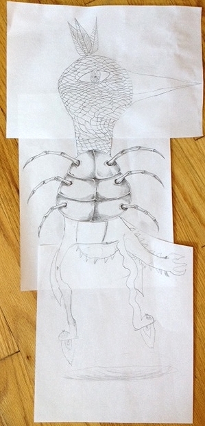
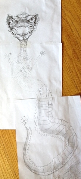
OK – here is how it works:  Each person gets a piece of paper, a pencil, an eraser and an assignment for one section of your creature.  Because there are 3 of us, one person gets the head & neck, one gets the torso/belly and arms and the third person gets the legs & feet.  Here is the key – these are the ONLY instructions that get shared!  The fun is in not collaborating on what kind of creature each person will be drawing.  If you have 2 people, one can do the head and chest, while the other does the belly and legs.  If you have 4 people, you can break it into head, chest & arms, belly and tail, and legs and feet.


Now, each person needs to go to a different room in the house where they can’t see what the others are drawing.  No peeking!  You will be amazed at what your kids come up with without any guidance or influence.


Finally, when everyone is done – bring the parts together and construct your complete creature.  Because you didn’t talk about what you are doing, you will likely have totally different parts… maybe a bird-like head, dragon-like torso and human-like legs for example.  You may need to do a little doctoring with scissors and a little eraser work to get the parts to fit, but surprisingly, it usually doesn’t take much!


The end result is fun, even outrageous.  Kids love the process and are thrilled with the roll they played in creating this new crazy thing.  We proudly display the end result on our refrigerator… The only challenge is what to do when you need a bigger fridge to display all of your creatures!

3 rooms 2.jpg

Happy Drawing,

Jason

Recent Projects: Period Miniature Portraits


I have discovered that one of my favorite things about doing art projects with clients is the opportunity to learn something new – and that was definitely the case on one of my most recent projects!


Enter Jen.  She and her boyfriend Mick are passionate about their hobby of doing period reenactments, specifically the period of the Seven Years War (also known as the French and Indian War).  Jen was faced with a common challenge; after many years with Mick, what could she get for a birthday gift that would surprise and delight him?  This is where her period knowledge came in – and my education began – when she asked if I could do portrait miniatures of she and Mick.


As I came to learn, portrait miniatures were common in this era.  They originally became popular among elites in England and France in the 16th century, but this popularity then spread across social classes in Europe and into the United States from the middle of the 18th century up until the mid-19th century when the rise of photography started to take over the role of the miniature.  It was common for soldiers to carry miniatures of loved ones, and for women at home to also have them of the men while they were away. Since Jen and Mick and their reenactment compatriots focus on the seven years war (which took place between 1756 and 1763) the portrait miniature was a perfect fit!


But this is not where my education ended.  While Jen had great pictures of she and Mick in period garb, Mick was not wearing a wig.  This all seemed normal to me until I learned that for a soldier of the status that Mick portrays, he would never be depicted in a portrait without a wig.  Adding a wig was the least of my concerns, however, when I also learned that these portrait miniatures were about 1 inch high!


Enter my next lesson – how to paint on an extremely small scale.  As a muralist, I am obviously used to working on a very large scale – and even when working on canvas, my paintings tend to be on the larger side.  I had certainly never done a 1 inch portrait!  Since I have done portrait work and even a good amount of caricatures (which are great practice in identifying what features make a drawing look like that person), I had that as my starting point.  As it turns out, this experience, plus a magnifying glass and some patience and some VERY small brushes, did the trick!  I thoroughly enjoyed the challenge – and more importantly, Jen and Mick were thrilled with the results. 


These portraits are on my main site – but here is a snapshot that includes my finger to give a sense of scale:

1 inch high portrait miniature


 Happy painting,

Jason

Drawing tip #2: Play with Composition

To help kick off the second of my drawing tips lets look at Wikipedia, which tells us “composition is the placement or arrangement of visual elements or ingredients in a work of art, as distinct from the subject of a work.”


So, what does this mean for the beginner?  Really, it is all about your choice of what part(s) of your subjects you include in your drawing and how you put those parts together.  The goal is to make your overall piece of art more interesting and engaging than just the subject by itself.  Focusing on this will ultimately make your drawing look more like a work of art vs. a “study.”


To illustrate this idea, I’ll keep running with the example of trees I used in Drawing tip #1.  If you look at this drawing, it comes off as a nice study of a tree --- but not necessarily an interesting drawing you might want to frame and hang in your house.  So what can you do to make it unique?

An example of a "study"

An example of a "study"


Try to zero in on just part of your subject and blow it up.  Emphasize an interesting shape or detail that catches your eye. Now think about where you place your subject on the paper.  Play with the idea of starting with your focus to the right or left of the center line. 


Next, think about the space around your subject.  Creating an interesting composition can be about what you choose to include or not include.  If there is a car parked behind the tree that takes away from what you want in your drawing – leave it out!  If the variation in the textures of bark is what pulls your interest – work on getting excellent detail in the bark – and maybe loosen the specifics of the background.  Then focus on different bark textures of multiple overlapping trees – and place them in an interesting composition to make the final piece more compelling.

An example of playing with multiple subjects to create an interesting composition


Once you start drawing what you see and focusing on interesting compositions – you are well on your way to making art you will want to show everyone you know!


Happy drawing,

Jason

Drawing tip #1: Draw What You See! (If a tree falls in the woods, does it look like a lollipop?!)

In the first of my series of drawing tips, I will focus on what you see.  This may sound obvious - but I have found that, when starting out, most people tend to draw what they think they see instead of what they really see!


The reason behind this is two-fold.  One is that we tend to apply logic when we first begin to draw instead of trusting our eyes.  Take for example tree-covered mountains.  If it is spring/summer and the mountains are covered with trees, they should be green, right?  Well, depending on the weather, time of day and your distance from the mountains – they likely will be many colors other than green (blues, purples and greys will be very common).  Now look at the trees in front of you – the leaves are all green, right?  Kind of – again, it obviously depends on the time of the year – but even in spring, leaves on different trees will be very different greens, and even leaves on the same tree will have a good amount of variation (tops and bottoms of leaves are often different, some will be in sun while others are in shadow, etc). 


Using the example of color is an easy way to illustrate this phenomenon – but the same concept applies to black and white pencil drawings.  Think about a portrait; logic tells us that when we draw people’s faces, their 2 ears and 2 eyes will be the same shape and size as each other and be symmetrically placed on either side of a person’s head.  However, this is rarely - if ever- the case.  Capturing the variations between a person’s eyes, for example, is one of the most important elements in making your sketch resemble the person you are drawing!


The second reason we draw what we think we see is because we have a tendency to think about objects as concepts or symbols rather than observing the details.  Drawing peoples’ faces works again here as an example.  We think of two eyes, a nose and a mouth – all with clear outlines.  But take another look at the nose and you will see that other than the very bottom and nostrils – there are no hard lines – just soft shading to distinguish the bridge of the nose from the rest of the face.  Now go back to the tree example.  Often times, we simplify trees into symbols – the “lollipop” for deciduous trees and the “spear” for evergreen trees.  Now sit and really look at that tree and you realize how far from a lollipop or spear that tree really looks… notice how the trunk splits into smaller and smaller branches and finally out to twigs.  Notice the patterns leaves or needles make around the outside of the tree as well as inside the outline of the tree. 

The "spear" - or what we think a pine tree looks like

The "spear" - or what we think a pine tree looks like

What is really there when we see past the symbol!


These are simplistic examples – but they can apply to any subject matter.  To get some practice in drawing what you see – grab common objects.  You may think you know what they look like, but force yourself to ignore that and draw only what you see.  Draw a pinecone, your hand, tree bark, a cloud – you name it.  And have fun doing it!!  Don’t get frustrated if it doesn’t look “right” the first few times. Like anything else, you will need lots of practice and careful observation until you start to get the results you want.


Happy drawing,

Jason