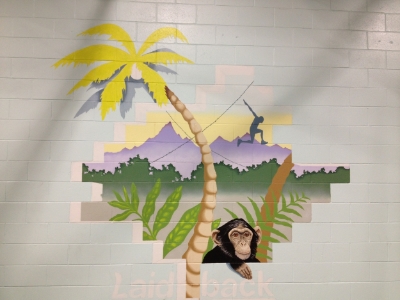
I had a blast working with Ryan at Laid Back Fitness on my latest mural. Laid Back Fitness (LbF) is a gym in Warwick, RI that follows the “MovNat” system of fitness, which focuses on training around fundamental human movements. Their classes range from more traditional weight training and kettlebell to OCR (Obstacle Course Racing), Ninja Warrior and parkour.
Recently, LbF expanded their space, more than doubling their original footprint to create a room dedicated to obstacle work that they are aptly calling “The Jungle”. As part of this expansion, Ryan reached out to me to help round out the environment LbF is creating in this new space. In addition to helping to establish the theme for the new room, the mural would also serve as a backdrop for photos at birthday parties the gym hosts.
To start the process, I took a trip down to Warwick to meet with Ryan. We walked around his gym and talked about his thoughts for the space and the mural. He explained that he liked the bright colors they have painted in the interior spaces – including the light blue on the wall of the mural, plus a bright lime-green (which is one of their brand colors) and a yellow called “Pecan Cream”. They also use black, grey and white in their colors, but not any red.
From there, we talked about subject matter. The main focus is the fact that this space is called “The Jungle”. To go with this, Ryan wanted to include the palm tree from their logo and also possibly a monkey (but not a cartoon-y monkey). There is also an older mural on the outside back wall of the gym that has a monkey as part of an evolution-themed design. Finally, Ryan wanted to include the silhouette of a boy jumping that is part of their logo for a sub-brand called “Laid Back Ninjas”
Working from this, I put together the following concept. The idea with the hole in the wall was a way to bring the inside and outside together. The monkey coming into the gym is there to keep with the “jungle” theme, showing the jungle coming inside -- but is also a nod to the mural on the outside (hinting that it is the monkey from outside coming in). Conversely, the silhouette of the boy jumping shows the people going out into the jungle. The idea for the criss-crossing vines came from criss-crossing ropes hanging from the ceiling, and showing the palm tree coming into the gym was a way to dramatically incorporate the logo. For the colors, the yellow in the sky is the same as the yellow in parts of the gym, and the bright green in the palm tree, the plants and the logo are all the LbF brand color.
Concept sketch
Ryan loved the concept and it was on to getting my design up on the wall in the final 10-foot by 10-foot dimensions. To keep this consistent with the concept, I did the original painting to scale, so I could blow it up and have it align perfectly with the actual cinder blocks. The process started with sanding and priming to make sure the mural is there to stay, and then step by step adding to the dimensions of the final painting as you can see from the photos below:
After sanding, priming and drawing
Detail of drawing
Beginning of painting process
A couple of steps further...
The end result hit the mark that Laid Back Fitness was looking for and will hopefully inspire current and future “Ninjas” !
The final mural!
Detail of monkey


