When I first met with Cathie, it was to look at a challenging space in her home that she wanted to do something with, but she was not sure exactly what.
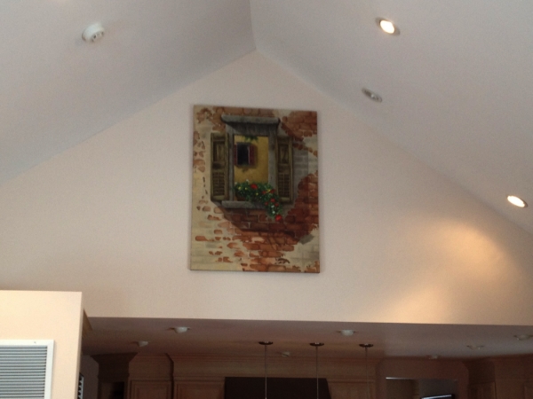
Cathie’s house has an addition with a vaulted roof, and the area where the addition meets the original house features a large triangle shape wall that starts at ceiling height and continues up the peak of the roof. The result is a big blank wall that is 17’ wide at the bottom and about 15’ high at the point of the triangle. Below is a snapshot of the wall:
In looking through the room and the rest of the house, I was able to get a sense of Cathie’s tastes color scheme. From other paintings, I could see that Cathie prefers realism, but also paintings with a looser, almost impressionist style. The color scheme includes yellows, gold, reds, browns and sage/olive green. I also talked to Cathie about her interests, and things she might like in a painting. In this conversation, we talked about Italian/Tuscan scenes, the French countryside, vines/flowers, adobe buildings and the painter Pino.
We then traded pictures and talked about different ideas for images that would work. We both looked at Italian landscapes, but ultimately decided that a landscape might look out of place at the height at which the painting would be hung. In these exchanges, Cathie shared the idea of doing a window – which was the perfect approach for the space while also capturing all of the colors and interests we had discussed.
Once we settled on the idea of a window, we looked at various source images to get a sense of exactly what the painting should look like. In the end, we found a few different images and I compiled different elements (plus a few from my imagination) to come up with the final composition.
Before starting work on the final 3 foot by 4 foot canvas, I did a painting sketch to review with Cathie and get her input. Below is a picture of this sketch:
Cathie was happy with it, but wanted to do only one background window to clean up the composition a bit, and she wanted a little more color in the foreground flowers. Below is the final painting and a picture of it hanging in the challenging spot where our conversations started:
Best of all, Cathie was thrilled with the painting, how it looked in her house and how it ended up being exactly what she needed for this previously big blank space!


