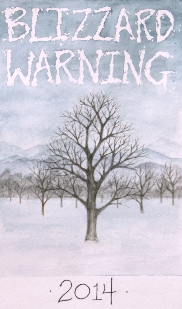
As I have mentioned in this blog before, I love the diversity of doing different types of projects – so I was excited to get started on this illustration for a wine label!
I was contacted by two couples who had worked with an outfit to make their own wine. They are now getting close to the bottling part of the process and needed to come up with a label for their creation. Rather than taking the usual path of using stock images for their label, however, they wanted to do something to reflect the fact that their wine was hand-crafted by friends. They were looking for something distinctive and special that would make the fruits of their labor more enjoyable from the moment they pull each bottle off the rack.
As a first step, they needed a name…
The group made their wine through the winter, so they wanted the name to reference the historic weather this year. Being from Connecticut, however, they decided to go more tongue-in-cheek with the name and reference the fact that in their area, they saw more hype and warnings than actual blizzards!
After talking with them about the wine and what they wanted, I came back with 2 concepts. The first was all about the hype they reference with the wine name, while with the second I wanted to create a much quieter image and focus on the look and feel of a winter day before a storm hits.
After looking at the different ideas, the couples chose to go with the second concept. To complement their wine, they liked the quiet beauty of the scene with the hint of something stronger in the background. With this decision in hand, I created the final piece below and will be working with a local printer to deliver the final touch for this wine project!


