As part of a re-brand and facelift for her yoga studio, my recent client Maria decided to use murals and hand-painted lettering add a special touch to her “new” space!
Formerly known as Bikram Yoga Natick, Maria’s 8-year-old business has grown and her offering has expanded, so she needed her name to better reflect what her studio is all about today. In addition to the name, she also wanted the look of her space to better reflect the fun and casual mood that is part of the experience she has created.
With the name “Hometown Sweat” chosen and a fantastic logo designed, Maria then worked with interior designer Lysa Wilkins to come up with a color scheme and the extra touches they would bring me in for.
First, Maria wanted me to paint her new logo on the half-wall under the front desk to really set the stage for clients as they first walk in the door. For the color scheme, we decided to use the color of the surrounding lobby walls and trim for the lettering and sweat drop to really tie the look of the space together. The background behind the logo is then the same as the workout room that you can see through windows behind the desk
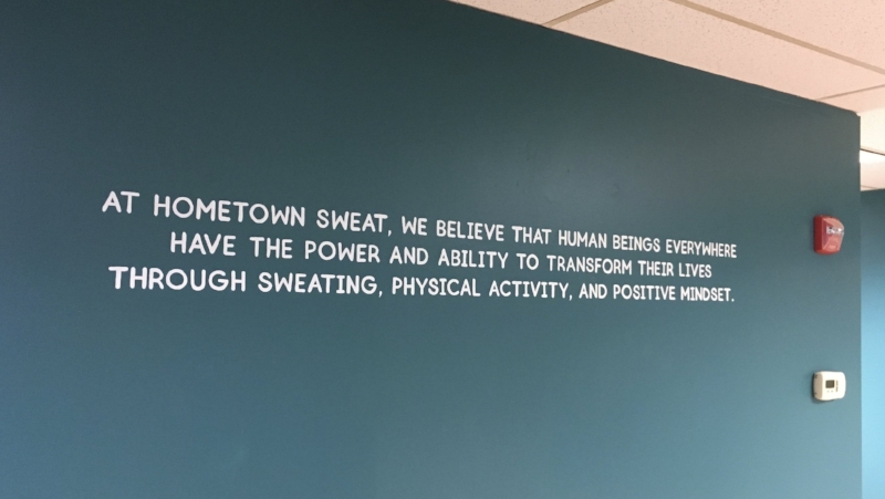
To share the inspiration behind the studio and bolster the meaning behind the re-brand, Maria then wanted me to paint her vision statement on a main lobby wall that everyone will see before entering the actual workout room. While there is certainly serious intent behind the vision, we chose a font that would add a light-hearted feel while also tying in with the logo.
Finally, on a wall near the changing rooms, Maria had a vision for a big, colorful sweat drop that would be unique, memorable and fun. For this, I decided to incorporate a lighter version of the green from the walls as well as purple to tie in to the adjacent women’s changing room. As a fun detail touch, I made the reflections on the drop match the shape and pattern of the lights above (as if it were actually reflecting!)
It was fun to see this all coming together and to share in Maria’s incredible excitement!
Enjoy,
Jason


