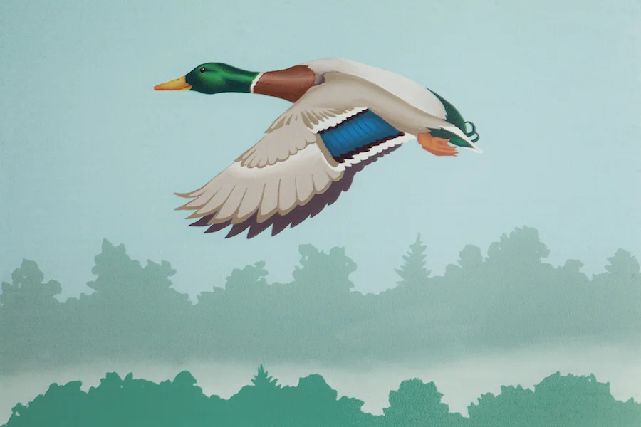
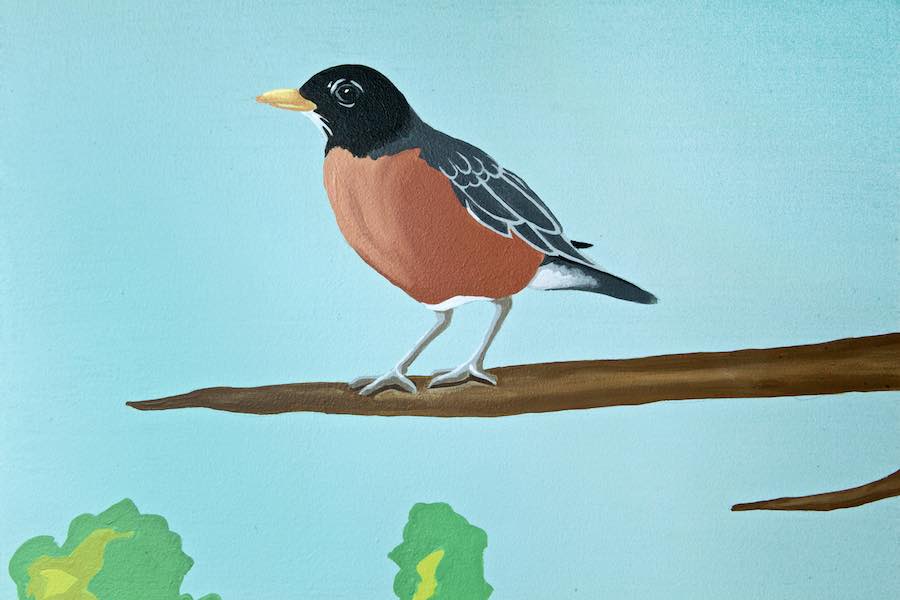
I don’t know if creative projects are like kids – where you are not supposed to pick favorites – but I have to say that this full-room mural is my favorite to date!
As the Wellesley Free Library was planning the renovation of their Fells Branch Library, I was fortunate to get a call to join the process. The Fells Library is a smaller facility, and they wanted to focus on the primary audience of young children (ages 0-6) in their design. The library team began their process with architects Johnson Roberts Associates, and settled on a theme that incorporated scenes from the town of Wellesley. The plan called for the tops of the bookshelves to be built out to look like buildings in the town and for the walls to be painted as a nature scene backdrop.
While the concept was decided upon before I was involved, the process of realizing the plan was extremely collaborative (and fun!). From choices of colors to details in the buildings to the content of my murals, there was input from the library team, the architect, the carpenter (Sean Reidy of Charles River Custom Carpentry), the painter and me.
After the planning stage, my first involvement was working with Sean (who happens to be my brother-in-law!) on the fantastic 3-D trees that jut into the space. Johnson Roberts called for this in their plans, so Sean’s first step was to block out the positioning of the trees with rectangular plywood that delineated how far out and low down the branches could go and be within code. I then got on my ladder to draw out the trees so Sean could follow my drawings for the final cutouts.
While Sean then went to work on the buildings and the painter painted and prepped the walls, I was on to designing my murals. The direction I was given was pretty loose – leaving most of the decisions up to me. I knew we wanted nature scenes to back up the town buildings, and one wall needed to incorporate a lamppost (to go with the lamp sconce light) as well as a representation of the “Entering Wellesley” sign. To make sure my scenes were tied to the town, I asked for recognizable places and then went out hiking with my camera. A few of the places that made it into my final paintings were Boulder Brook path, Morses Pond and the town green near the Post Office. For the birds and animals, my goal was to make sure that I used native animals that the kids could see in their backyards. The only specific request I had was to include a goose near the town hall building (where there is a constant presence of geese!).
Another decision I needed to make was the look/style of how this would all be painted. While the audience is small children, I wanted the murals to be timeless – in terms of both the relevance ten years (and more!) from now, but also the ability of my murals to appeal to people of all ages. While I wanted the overall look to be clean and bright, I also did not want it to be cartoony at all – instead choosing to do just enough detail to make it realistic while keeping it simple enough to appeal to kids. When it was complete, one of my favorite comments I heard was that it was “child-friendly without being childish”.
With all of this in mind, I started doing my designs – which are scale paintings done in the actual paints that would be used on the walls to give an accurate representation of what the final product would look like. I submitted these to the library team and they loved them – just saying “go!”. Here are pictures of a few of my designs.
With the design direction approved, I was on to painting the walls. I started on the side with no buildings, focusing more on nature – including the Boulder Brook Path shown here:
On this side of the room, I also had the 3-D trees I painted to look like bark and incorporated them into my mural:
Also on this side of the room is where I represented Morses pond. I wanted to get a sense of the distant shore and reflections in the water higher in the mural, but also wanted to get the beaver right down at small child height:
As a transition to the “town” side of the room, I did the town green with the lamppost and sign. Of course, the sign is not actually in this location, but I needed to take some creative liberty to include both elements in this section of wall:
As the theme transitioned to buildings, my focus shifted more to being the background with trees and birds – but I still found a couple of opportunities for other animals – including a mouse that is also right at child height:
As I was painting this, several tours came through and I had the opportunity to hear people’s reactions. Some of my favorites were how the space was “magical” and “inviting” – but I think my favorite was “I want to live here!”
After 5 weeks on-site, I was done with my largest mural project yet! I enjoyed every step of the way – and I was even a little sad to leave on the last day of painting…
Below are some more pictures of the space – Enjoy!!
Enjoy!
Jason


