So much of what I do is about making things unique, custom and one-off. For walls, there are plenty of beautiful colors of paint or patterns of wallpaper that can be used to make a space look great – but since anyone can buy the same paint or wallpaper, none of them can make a space truly unique.
The same is true of furniture. Creating a specialty paint finish can take a piece from common to custom – from blending into the woodwork to a centerpiece of a room.
My recent client Nikki was in the process of completely re-doing her kitchen – and she wanted to transform her table to go with her new look, but also be something special…. Which is when she called me!
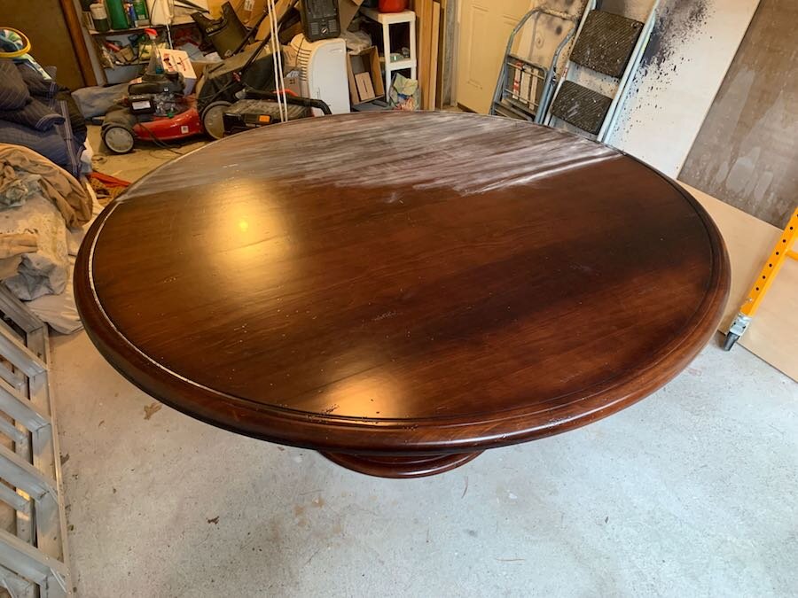
The table Nikki had was a high-quality piece that was in good shape, but the brown finish on the large round (6’ diameter) piece wasn’t working with the look of the space. To address this, Nikki wanted a distressed finish using colors that would work with her new kitchen. After talking about options, we settled on a look that would use a blue as the under-color and a gray as the top color. This way, when the gray is distressed, it reveals the blue underneath. This looks great, but also references historical pieces that were painted different colors over the years – colors that are then revealed as the most recent paint wears off to reveal the older colors underneath.
Nikki loved the idea – so I was off to working on the table.
As is always the case, the first step was to prep the table by thoroughly cleaning it and then sanding it (to make sure the paint adheres). After cleaning, I primed the table and then painted the blue that I mixed to get just the right color. When the blue was dry, I sanded it to keep the finish smooth (which also starts the distressing process). The primer I used was a slightly lighter color of gray than the final top color – so that any primer that showed in the final finish would add to the depth of the piece.
The original finish. After cleaning, the sanding begins
After sanding, the table was painted with a gray primer, sanded, painted with the blue undercoat and sanded again
With this layer smooth and cleaned off, I was on to the gray. When painting furniture, I am careful to keep the application as consistent as possible to create a hand-applied look that still looks clean and professional.
When the gray was complete – I moved to the fun part; the distressing process. When doing this, I am always careful to be very deliberate and light-handed. You can always distress more, but once you go too far it is hard to fix! I also focus on areas that would wear from use so the end result looks authentic. As I did this process, I shared pictures with Nikki to make sure I was accomplishing the look she was going for.
Once the distressing was complete – it was on to the finishing clear-coat! When doing finishes like this, I use chalk paint because it responds well to sanding and distressing. However, chalk paint also needs to be sealed – so I use a water-based polyurethane to get a hard, durable finish that won’t yellow (oil-based poly’s yellow very quickly). Sanding between coats to insure good adhesion, I applied 3 coats of a matte-finish poly, and then I rubbed the final coat with a fine steel wool to give it a mellow, burnished look.
Here is the finished result!
Enjoy,
Jason


