I don’t get the opportunity to collaborate with other artists too often – so it was a thrill to work with the Origami team at Origamido Studio on a large mural and installation project at the Wellesley Free Library!
The Wellesley Library completed a large renovation project this fall, and I was thrilled to be asked back (after I worked with then at the Fells Branch) to be a part of the project. During the planning process, The library team knew they would be doing a origami-influenced installation of butterflies in the Children’s Room, and they knew they also wanted murals in the space, but the concept was left open. The one direction I had was that the space is also used by adults, so my designs needed to be appealing to both children and adults
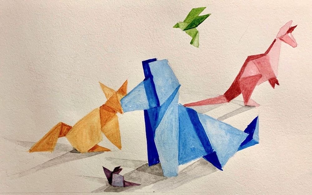
My first instinct was to work with the origami theme. To make my designs child-friendly but also more sophisticated, I decided to paint origami subjects as if they were a fine-art still life painting. I wanted to use bright colors for kids, but also play with the compositions and shadows to elevate the paintings. As a proof-of-concept, I did a quick watercolor sketch to present to the team:
My concept sketch for the library team
The idea was a hit! My next challenge was figuring out how to find the origami I would be painting in order to do many of these compositions – so I reached out to Michael LaFosse and Richard Alexander at Origamido Studio. To tie my paintings to their installation, I asked if they would be willing to create origami subjects for me that I could then arrange and paint – and they were more than happy to help! What they delivered far exceeded my expectations – with boxes of amazing paper animals and plants for me to work from (I had requested animals for the walls and plants for the columns). I asked that all of the origami be made with gray paper so I could arrange all of my compositions and then make my decisions on colors. Below is an example of one of my studies of these origami creations:
My photo of 2 Origamido creations as models for my paintings
As usual, my next step was to do my concept paintings. To add to the depth of the painting, I first painted them in all sepia tones and them painting the colors over the top. Below are examples of the sepia painting and the final color version:
The first step in the design painting
Final color version of design painting
With all 10 of my concept paintings done and approved, I was on to the final walls! As I did with my designs, I painted the final murals first in sepia tones and then in color – below is an example:
The sepia under-painting on the final wall
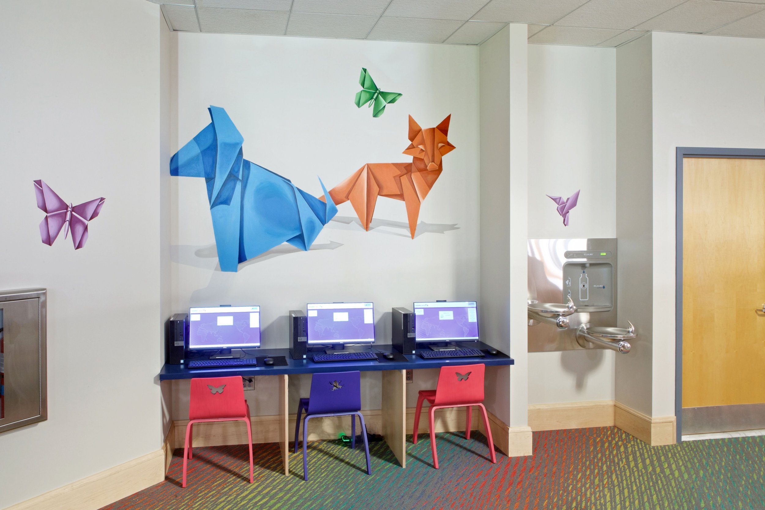
The final mural (photo by Dan Nystedt)
To give a sense of scale, here is the largest of the murals in the process of being painted:
A candid shot of me in the process of painting one of the murals
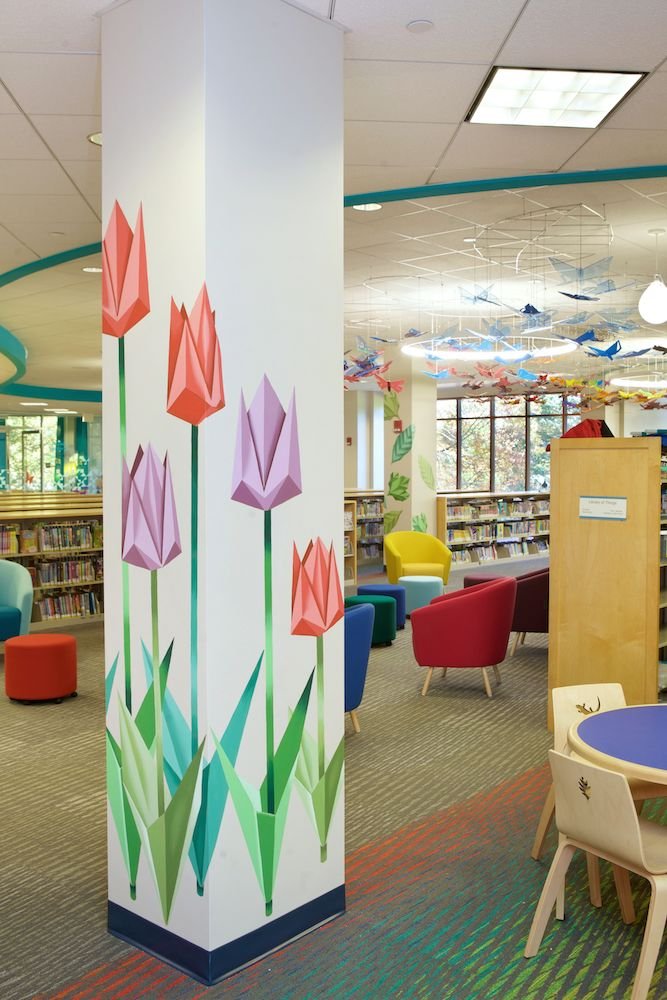
In the end, the murals and the butterfly installation worked great together! Below are all of the murals, plus some shots of the installation. A special shout-out to Dan Nystedt of Nystedt Photography for his beautiful photos. Enjoy!!


