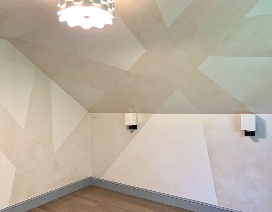
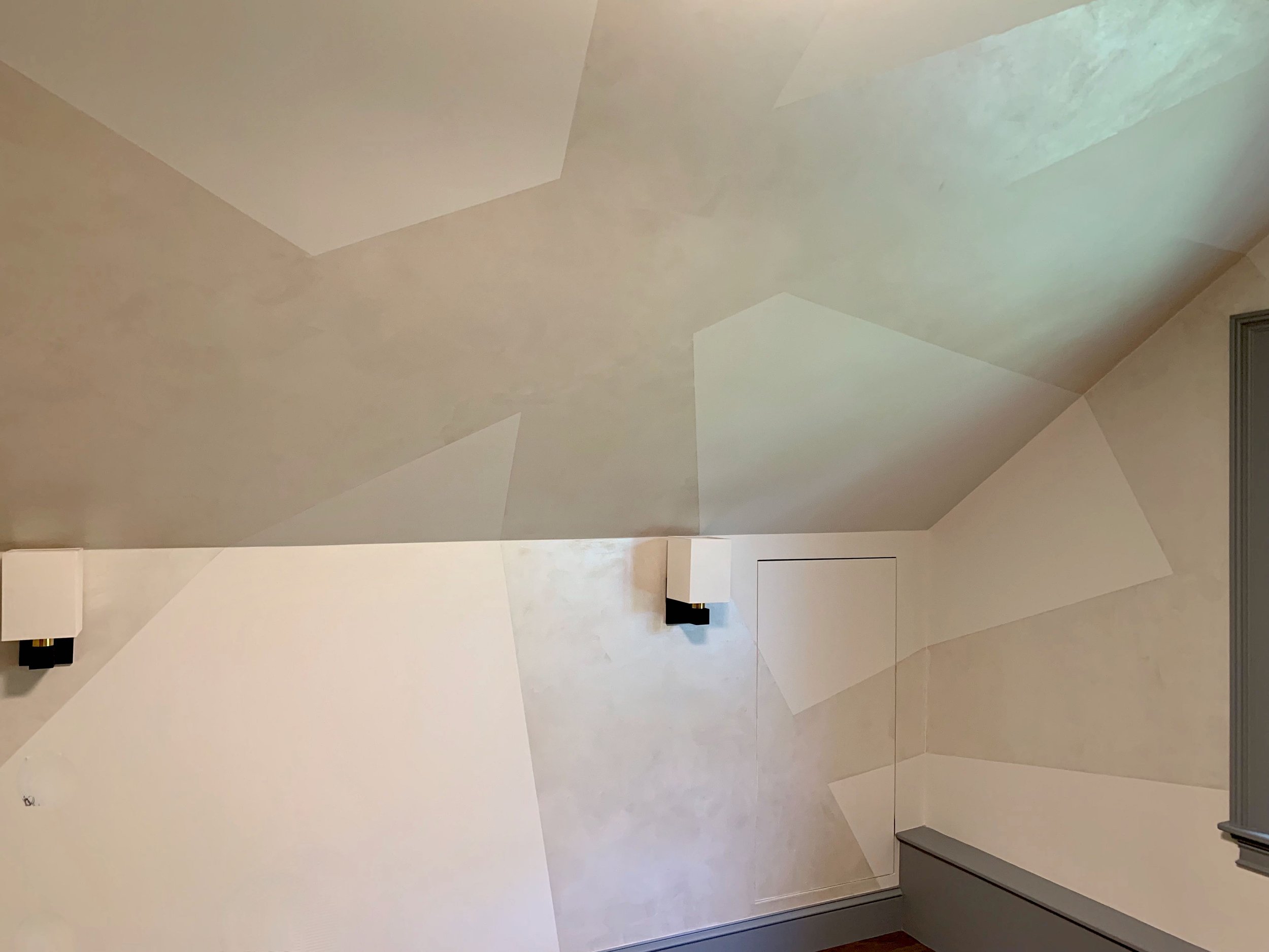
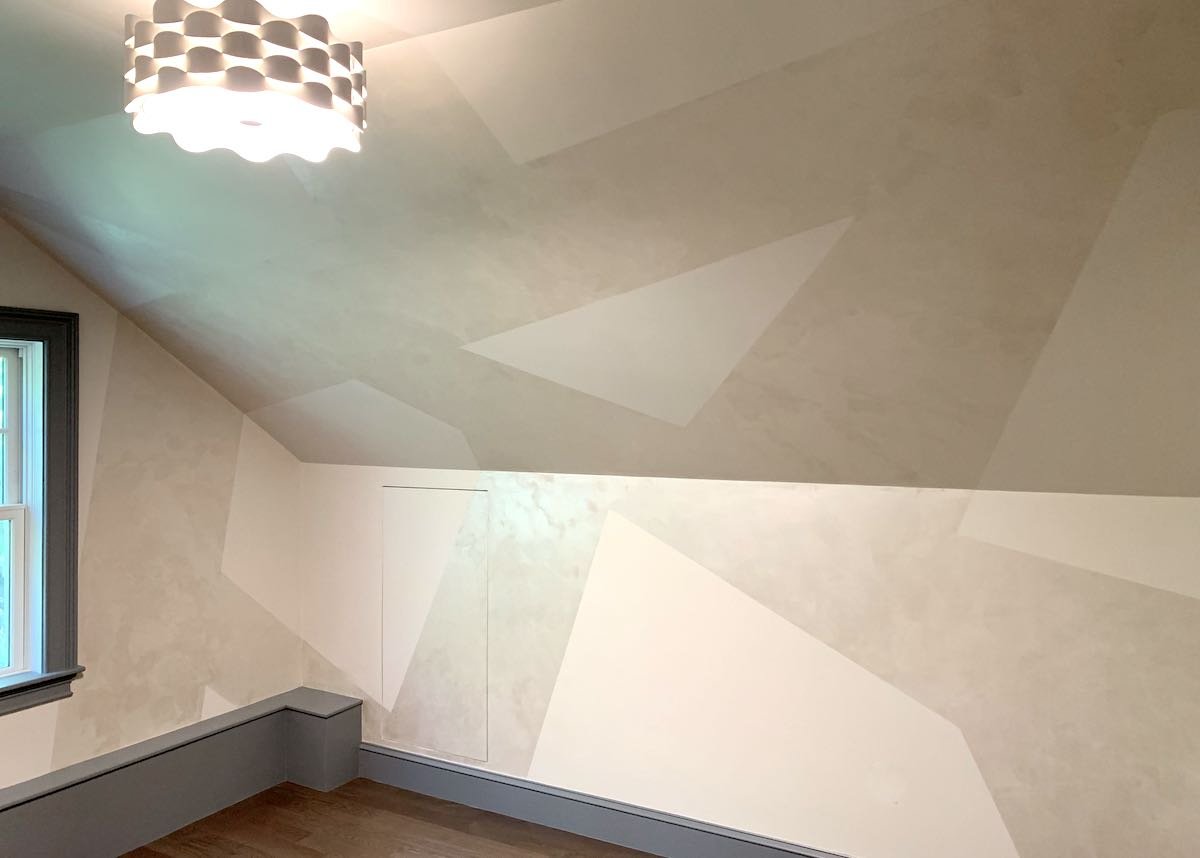
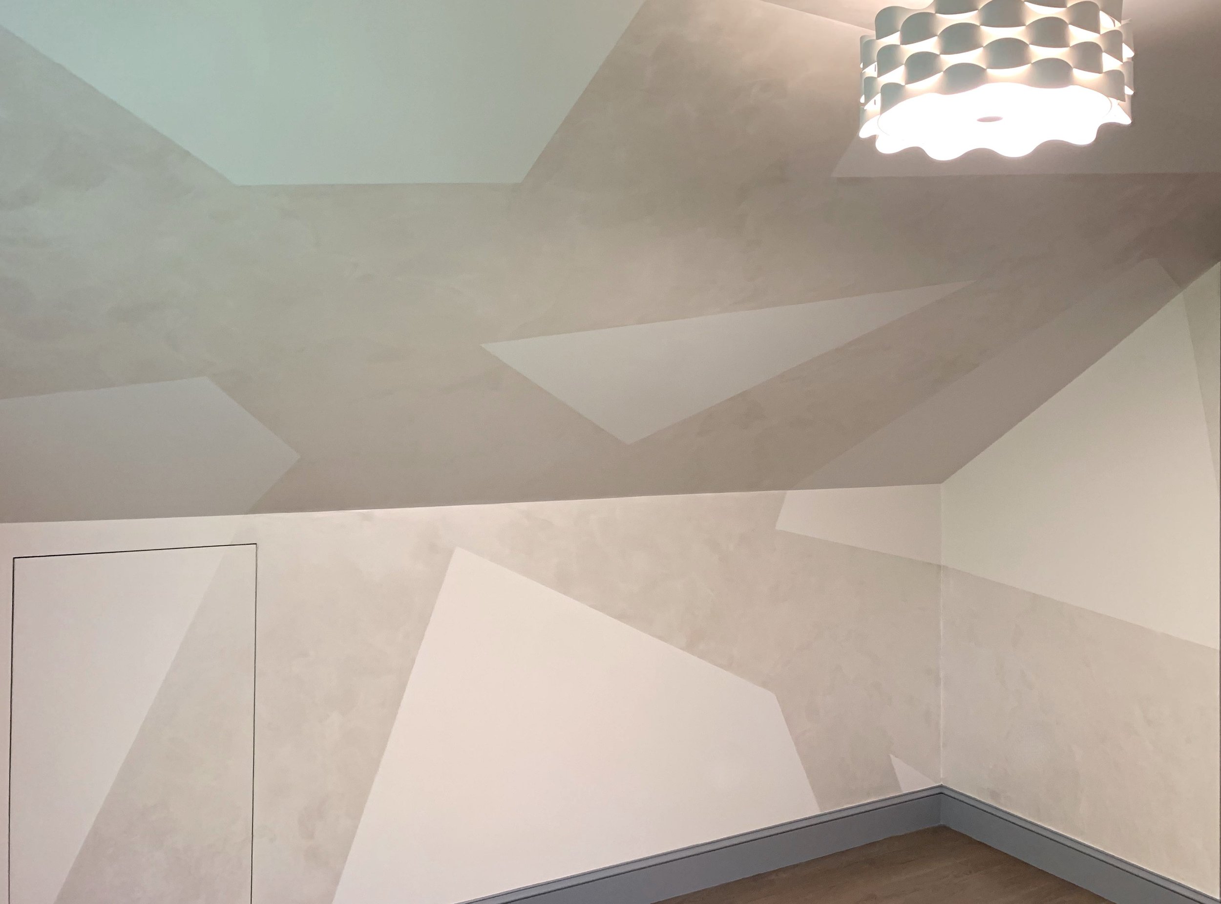
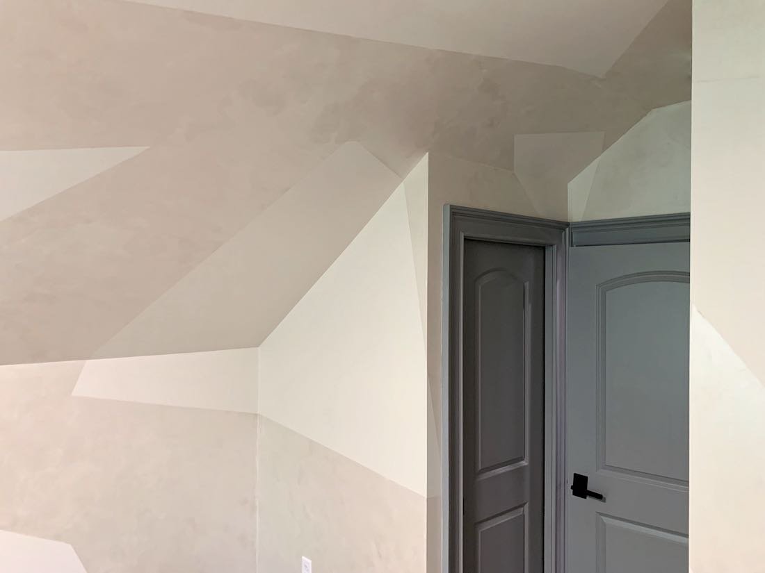
“Now that’s cool”… We often step back and admire our specialty finish projects when they are complete, and this one was no exception!
Starting with the inspiration provided by one of our interior design partners, my colleague Joan and I were tasked with transforming this top-story vaulted-ceiling room into one big, graphic, contemporary work of art.
The idea was to start with the idea of very thick stripes intersecting at various angles. We wanted the shapes created in negative space between the stripes to be as important to the design as the striped themselves – so a big part of this project was the design step. We began with a full day just figuring out where the stripes and shapes should fall to make the room interesting and beautiful from every angle.
To elevate the level of interest, we then used metallic plaster instead of paint to create the pattern. This gave us beautiful reflections and variation within the stripes that make the colors shift as you walk through the room.
In the end, the client and the designer loved the result --- as did we!!
Enjoy!
Jason

