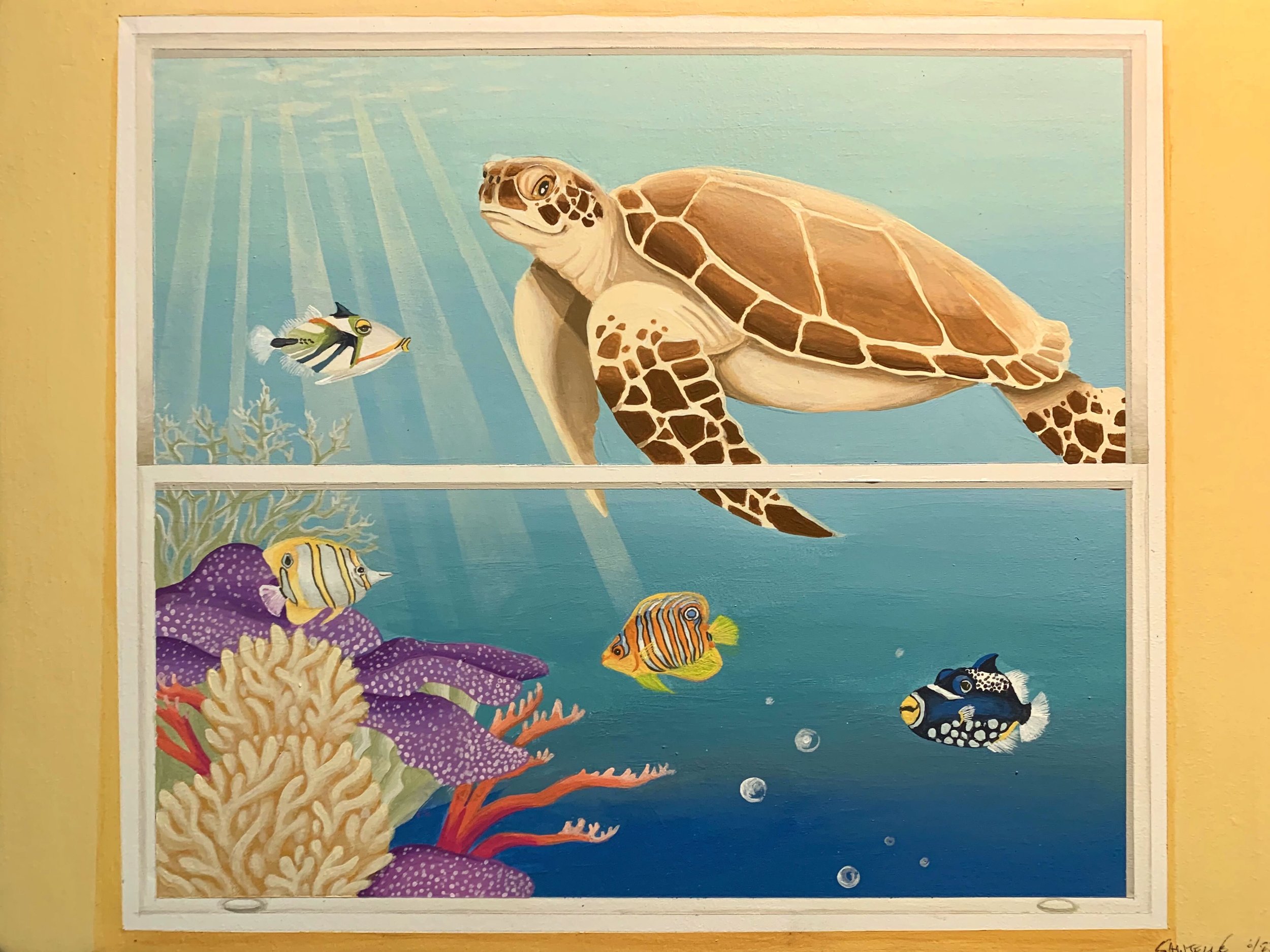
This is now the 8th library I have done a mural for – and just like the previous seven, I loved working on this project!
It began back in February, when I met with library director Amy Rhilinger. It was a fun meeting, focused on brainstorming a mural that would fit the space. One of the challenges was that there was no “good” wall on which to do a full-wall mural, because all of the walls were broken up by windows, shelving, etc. The library was also not ready to start with a large or multi-wall project – so we had to figure out how to make an impact with a smaller mural and make it “fit” in the space.
Amy wanted something that would capture the imagination of the children visiting the space. She shared that the mural should have a sense of fun and whimsy – and would ideally be something that could inspire stories. Using nature is always good for public spaces, but we needed how to make nature fun and fit the space.
Looking at the windows, I suggested the idea of painting another “window”, but creating a scene outside that would be exactly what would NOT be a scene you could see out a window in Attleboro! Amy loved the idea, and we began tossing around ideas of all the fun things we could depict on the other side of our “magic window”.
When the project was approved a few months later, we dusted off our ideas and decided to go with the underwater theme, taking advantage of the bright colors and whimsical idea of an ocean outside the window!
As always, my first step is to do a “concept painting” – basically a small, but to-scale version of what I propose for the wall. Below is the concept I proposed:
After reviewing my design, Amy and her team were on board! Once the timing worked for the library, I began the painting – and the results were just what everybody was hoping for!
Below is a shot of the mural, plus a shot from further back, showing the actual window that is next to it.
The final mural!
Next to the “actual” window
Enjoy!
Jason


