Patterned Wood Floor

Unlike most of my decorative finishes, this diamond-stained floor in Wellesley, MA involved a lot of math!

It was a pleasure working with our client Annie, her designer and my colleague Joan Kingsbury to create this dramatic foyer floor. Annie and the designer knew they wanted a diamond-inside-a-diamond pattern in multiple stain colors to complement the other design elements in the space. It was then up to Joan and I to help figure out how to make this happen.

The first step was to meet at the house and start measuring.  The designer wanted the diamonds to be centered with the front door, so we started working from there.  Our goal was to create a shape/size that could fit full diamond shapes between the door and the stairs (without being cut off), while still fitting nicely side to side.  This is where the math started – and we used our figures to tape out shape sizes there on the spot so we could collaborate on the approach.  We also used this meeting to look at different stain colors and to sketch out the look of the pattern…. It was a very productive meeting!!

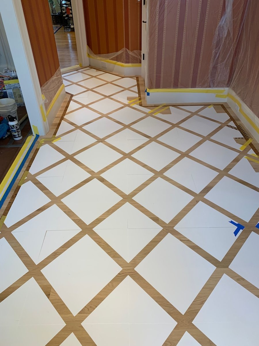
With these elements decided, our next step was to have stencils made to insure a clean, consistent pattern for the final product.

With our stencils and satins in hand, we were then on to creating the floor finish!  We started by creating a border that would work with our diamond layout (more math!):

With this complete, we were on to laying out the stencils:

And then on to the stain!  First we stained the darker “lattice” pattern and then the lighter, inside diamonds:

The end result is striking, and exactly what Annie was looking for!:

Enjoy!

Jason

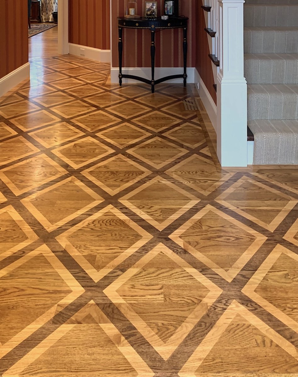
View from the front door

Stain pattern continued through floor vents

A Truly Custom Mural

Of course, all of my murals are “custom”, but this recent bathroom mural project in Natick is a great example of what this means!

My client Allison reached out to have me help create a space her 11-year old son would be happy with again.  Allison’s challenges began when she had her son’s bathroom renovated – only to discover that he was despondent about the removal of all of the interesting old tiles he loved – so much so that he would only use their primary bath!

Allison initially thought about painting the tiles – which can be done – but I suggested doing a mural to add much more interest to the room.  The idea I presented was to paint a tile pattern on the portion of the wall without tiles and incorporate some of the patterns and colors form the old tile – while also including puffins (which her son loves!).  Below are pictures of the old tiles as well as the puffin shower curtain in the room.

Allison and her son loved the idea – so I was on to doing a concept painting.

While I wanted to incorporate the old, I also wanted to choose colors and design elements that would tie into the modern look and palette of the renovated space.  I used the medallion pattern of one of the tiles, but instead of the cream and gold colors, I used white and orange to tie in with the orange on the shower curtain.  The bright lime green is a nice clean color that also ties into the curtain and balances well with the orange and blues.  There were also small rectangle tiles in blues and grays (I didn’t get a photo of these) that I wanted to include.  I put all of these elements together for this design:

Allison and her son were completely on board after seeing me design and I was on to painting the mural!  When it was complete, the whole family was thrilled – sharing that it was better than they ever imagined it could be!!

Enjoy!

Jason

The final mural

Puffin detail

Medallion detail

More Ombre Painting!

The best kind of client is a return client!  This Cambridge-based firm has now called us back 3 times to paint ombre finishes in their various office spaces.

For this particular project, our orange, green and turquoise ombre finishes helped brighten the space and keep the office lively!

Enjoy!

Jason

Commissioned Painting – Summer all Year Long!

My recent client JJ is a boating enthusiast who wanted to enjoy summer all year long with a commissioned painting of his boat and yacht club.

JJ knew the angle he wanted, showing the city in the background.  We used the picture below as a basis for the angle, but JJ wanted the city a little larger and easier to see – and he wanted the painting to be much brighter while still keeping the vibe of sunset.  I also had a sample of the wallpaper in JJ’s newly renovated bedroom (where the painting was slated to hang) to make sure my color selections would go with the room while still standing out against the wallpaper.

The reference image for the club

In addition to altering the city and color scheme, I needed to make a couple more alterations.  Most importantly, JJ wanted to include his boat (see below for the picture I used).  This also necessitated that I show the club at high tide so I could include the boat in close to the club!

Picture of JJ’s boat

After doing a sketch to show JJ my ideas for composition – I was on to the painting!  Both JJ and his fiancé love the painting and are enjoying the summer as the cold weather rolls in

Enjoy!

Jason

The final paining

Specialty Plaster Tray Ceiling

In the planning stages of this decorative finish project, I worked exclusively with my associate Michael at design firm Eleven Interiors.  Michael was working with the client on multiple rooms of the home for a large-scale renovation and wanted something unique and special to elevate the dining room.  With the idea in hand to paint the walls and tray-ceiling surround the same color, Michael came to me with the goal of achieving something metallic and glossy in a champagne/silver color for the recessed tray ceiling.

With this direction, I suggested a specialty metallic plaster finished in gloss polyurethane to create motion, shimmer and shine.  Michael liked the idea, and I was on to creating sample boards!  I did a few examples showing variations in color and sheen, which Michael shared with the client for the final choice.

By the time I got to the house for my piece of the project, the larger renovation was wrapping up – so the client was at the home preparing to move back in. When she saw my finish completed in her dining room, she was thrilled!  In particular, she loved the hand-crafted, one-of-a kind look… As Michael was shooting for, it felt “special”. She told me “I never had any idea this was even an option.  I’m so happy my designer suggested it!!”.

Enjoy!

Jason

Venetian Plaster Fireplace Surround

With more people taking advantage of the new gas or electric fireplace inserts – we are getting more calls to do something special with the drywall fireplace encasements that used to be brick with traditional fireplaces.  The benefit with the new setup is that the sky is the limit for the finish options!

Working with my colleague Joan and Interior Designer Lulu Friedman of Didi interiors, we wanted to make this particular fireplace surround a focal point of the room!  Lulu and the client liked the upscale stone-like look of Venetian plaster, so they chose to have us use Venetian in shades of dark gray.  To elevate the look and make it a bit more special and eye-catching, Lulu had the idea to also add a bit of gold “character” to the finish.

As always, we started with a sample board to make sure we hit the mark in creating the finish Lulu and the client envisioned.  With the board approved – we were on to plastering the fireplace!

As we worked on the variation in the paster and gold, we collaborated with Lulu and the homeowner – resulting in a finish everyone was thrilled with!

Enjoy!

Jason

Art Ceiling!

It’s always good to work with my friend Jessica Tolman of Briar design – and this “art ceiling” project at a beautiful contemporary home in Newton was no exception!

Our client Rebecca was working with Jess to fine-tune some of the rooms in her home, and as they were working on the dining room, Rebecca had the idea to make a statement on the ceiling!  After looking through my website, they were inspired to do a graphic pattern of crossing lines and called me in to help make the idea come to life.

When we met, we talked about layout ideas and also chose a color based on the rug and seat cover they had already chosen (these are not in yet – so not in the photo!). I then took my notes back to my studio and created two sample boards – one to show the full-scale thickness and color of the stripes, and another scale layout of the stripes on the ceiling.  Rebecca and Jess loved the boards – so I was on to painting the ceiling!

The first step was to measure out the line placement to match my original design, and then plan thickness and opacity for each line (the lines are created with glaze mixed with paint and range from dark/opaque to light/translucent).  When I was done, Rebecca was thrilled – and asked me to sign the art I created on her ceiling!


Enjoy!

Jason

Grandpa’s Gift of a Kid's Room Mural!

This kid’s room mural was a fun first – It was a gift from the baby’s grandpa!  As it turns out, this particular grandpa is a past mural client of mine, so I had the pleasure of working with him again AND meeting his daughter, son-in-law and new grandson!

My client Ed first reached out to me before Christmas last year to let me know that he was gifting a mural to his daughter Kaitlynn and her husband for their son Parker’s bedroom – so this project has been a while in the making.  I first met with the whole family in March and learned that they wanted a nature scene with mountains and maybe water.  We brainstormed while looking at the 8 foot by 13 foot wall in Parker’s room and I did a quick sketch suggesting a scene with mountains reflecting in a lake and trees in the foreground.  Everyone loved the idea – so after some conversation about colors, I was off to do the design!

As always, I did a scale painting of my proposed design, and when I showed everyone my concept they gave me the green light to paint it as is!

Fast forward to last week, and I was back in Parker’s room to paint the final mural.  This timing worked out well as the family was away for vacation – so we didn’t have to worry about my mural painting interfering with nap time!!  I thoroughly enjoyed painting this, particularly the challenge of the reflections.  I was actually a little sad to leave the mural behind when I was done --- but I was thrilled when they returned from vacation and let me know how much they liked it!!

Enjoy!

Jason

The 8’x13’ full-wall mural

Close-up of the reflections

Another close-up — this one of the left corner

Another Kids’ Library Mural!

This is now the 8th library I have done a mural for – and just like the previous seven, I loved working on this project!

It began back in February, when I met with library director Amy Rhilinger.  It was a fun meeting, focused on brainstorming a mural that would fit the space.  One of the challenges was that there was no “good” wall on which to do a full-wall mural, because all of the walls were broken up by windows, shelving, etc.  The library was also not ready to start with a large or multi-wall project – so we had to figure out how to make an impact with a smaller mural and make it “fit” in the space.

Amy wanted something that would capture the imagination of the children visiting the space.  She shared that the mural should have a sense of fun and whimsy – and would ideally be something that could inspire stories.  Using nature is always good for public spaces, but we needed how to make nature fun and fit the space.

Looking at the windows, I suggested the idea of painting another “window”, but creating a scene outside that would be exactly what would NOT be a scene you could see out a window in Attleboro!  Amy loved the idea, and we began tossing around ideas of all the fun things we could depict on the other side of our “magic window”.

When the project was approved a few months later, we dusted off our ideas and decided to go with the underwater theme, taking advantage of the bright colors and whimsical idea of an ocean outside the window!

As always, my first step is to do a “concept painting” – basically a small, but to-scale version of what I propose for the wall.  Below is the concept I proposed:


After reviewing my design, Amy and her team were on board!  Once the timing worked for the library, I began the painting – and the results were just what everybody was hoping for!

Below is a shot of the mural, plus a shot from further back, showing the actual window that is next to it.

The final mural!

Next to the “actual” window

Enjoy!

Jason

Geometric Mural Panel

This recent mural panel design was the result of some fabulous collaboration with the homeowner and interior designer Jessica Tollman of Briar Design.

Jessica and the homeowner (Rebecca) called me in to do some interesting ceiling treatments (more to come on this in the near future!), including the idea to do a geometric pattern on the sunroom ceiling.  Rebecca wanted the pattern in golds to pick up on tones in the adjacent spaces and liked a grid-pattern ceiling from my website as the inspiration.  As the three of us looked at the space, Jessica suggested incorporating circles to also tie in to some of the art in the space.  After talking through their ideas, I did a quick sketch incorporating the grid idea with partial circles, using 2 different colors of gold.  Rebecca and Jessica liked the idea – so I was on to creating a scale concept painting!

When I came back with the concept, Rebecca had a new art installation in the room.  Between the new installation and the chandelier, Rebecca and Jessica decided that my ceiling concept would be too busy in the space – but they loved the design!  As we walked with the design back toward the entrance, Rebecca noticed that it worked perfectly in the stairway just off the entry foyer.  We held it up and then taped off a size that would work best for the space– and ultimately decided to do the same pattern as a 40”x48” mural panel!  To better match with the space, I needed to alter one of the 2 gold colors I used – so I updated my board with the new color to get Rebecca’s final approval. 

With final approval in hand, I was off to painting this canvas! Delivering it was fun, as both Rebecca and Jessica felt it was just perfect in this space!  The colors tie in nicely with other elements in the adjacent spaces, the shapes work great with the nearby light fixtures and the different reflections of the metallic paints add a great level of depth and interest!

Enjoy!

Jason

Showing the light fixture (also notice the gold ball in the background lamp). Odd lighting makes the light look pink and the painting look green — in reality they are very close!

View going down the stairs

Custom Mural for New Business Space

I love working with repeat mural clients!

This was the case with my recent custom mural for The Lark Center in Norwood, MA.  Two years ago, I thoroughly enjoyed creating a mural for Lark’s first facility – so I was thrilled when they called me back to create a second mural for their new, soon-to-open facilty!

The Lark Center provides therapeutic services - supporting children with developmental, neurological, cognitive, motor, or sensory differences. Their first facility concentrates on young children, so my mural was designed to be fantastical, whimsical and engaging for these kids.

Their new facility, however, focuses on helping people from middle-school age through young adults.  In my meeting Rebecca Erwin, she explained that their clients are often neuro-divergent and have a different way of thinking – and as such, wanted the mural to be something that they could connect and engage with.  She wanted something colorful and fanciful, but also calm, soothing and more mature than my first mural.  She wanted a nature theme, and something that perhaps used a perspective from up high looking down (as opposed to my first mural, which was the opposite).  This perspective would also be in keeping with the name of this new center: “Sky Lark”!

We brainstormed about ideas, and I suggested a landscape that exaggerated colors that exist in nature.  I talked about a sky that could be either sunset or sunrise, with distant mountains in bright colors and a fantastical bird.  Rebecca loved this idea, and asked that I merge my fantastical bird idea with a lark.  With this in hand – I was off to creating my to-scale painting!  Below is the image I created:

My to-scale design painting

With this design in hand, I was back to The Lark center to show Rebecca and her colleagues – and they loved it!!  From there we scheduled a time for me to start and I was on to painting this 27-foot mural!!!

When I paint murals like this, I always start with the background and work my way forward, also working top to bottom.  Here are a few in-progress shots:

And now for the final result! 

The full wall — plus a soffit that is closer to the door when people enter the space!

Enjoy!!

Jason

Specialty Bathroom Wall Finishes

While I do decorative finishes on walls, ceilings and floors in all kinds of spaces – probably the one space that would look good with a specialty finish in any home is the bathroom!

Because bathrooms are usually small - they are a great place to take design risks or just add a splash of decorative interest.  As a result, I have done finishes in many bathrooms – including this recent specialty plaster project in South Boston!

My partners at Eleven Interiors reached out for a solution in this space that complemented the colors in a sisal wallpaper in the adjacent room.  The goal was to create a look that was bold, elegant and masculine.

As always, I created some sample boards using a few color variations – but all using this same plaster, which creates this soft but metallic look.  The sisal paper was largely in the taupe family, but it had darker grey/brown colors that I wanted to pick up on. After looking through the options I presented, the client went with the darkest of the colors – which looked fantastic in the space!

Both the client and designer were thrilled with the result and definitely felt it was “mission accomplished” with the elegant and masculine goal.

Enjoy!

Jason

Decorative Painting to Hide Speakers

After installing this impressive wallpaper mural in a Wellesley home, the designer and homeowner were disappointed to see these glaring white speaker covers detracting from it!

This is when we got the call!  Due to the detail in the wallpaper, the thought was to just do washes of colors to camouflage the speakers – anything to just minimize the impact of the white covers.

Instead - once I was onsite, I decided to continue the pattern as much as possible to really make sure the eye was not drawn to the differences.  Adding to the challenge, the patterns in the wallpaper did not repeat anywhere in the room (!), so I had to make my best guess as to what would be in these spaces!  I also wanted to “generalize” just a bit so my camouflage job did not get too busy and attract attention for the opposite reasons. Adding MORE to the challenge, I needed to use very thin layers of paint to prevent the paint from blocking the speaker holes!

Everyone was thrilled with the results!!

Enjoy,

Jason

Left speaker before

Left speaker after

Right speaker before

Right speaker after

Room after… What speakers?!

Custom Decorative Finish for Restaurant Re-hab

As part of the refurbishing of this restaurant space, my colleague Joan and I created this unique plaster and rust finish for the soffit that runs around the top of the dining room.

The owners of the soon-to-open Marseille restaurant in South Boston wanted a finish that had a rustic, weathered, French-countryside look.  The colors needed to be neutral enough so they didn’t dominate the space, but we needed to incorporate some of the green tones of the (fabulous!) street lamps and the teal of the seat cushions.

We took this guidance back to the studio and came up with this finish that uses a “rust” base that peaks through a multi-colored plaster application.  As always, we started by creating a sample board to show our vision for the space – and the owners loved it!

With this, we were on to creating the French countryside rustic soffit.  To keep the final result looking authentic, we started by applying a subtle texture, then created our rust base layer and finished by dragging the plaster over the rust texture.  The owners were thrilled with the result!

We just went back to see the space completed with the beautiful design details the restaurant team added and the space looks great!  If you are in South Boston, definitely stop in for an amazing meal prepared by a great team of people!

Enjoy!!

Jason

Hand-painted Graphic Feature Wall

This recent client in Wellesley, MA was working with her designer to add some interest to her primary bedroom walls when they called us!  Most of the walls had paintings or mirrors, but the large wall (12’ high by 17’ wide) behind the bed looked too plain, and the scale of the wall was making it difficult to find a solution.

Designer Donna Hochman of Distinctive Interiors had the idea of using criss-crossing lines in tones of dark gray to complement the rest of the room and asked us to come up with a design.

After taking some measurements and drawing a to-scale framework of the wall, I worked with basic ideas of composition to lay out the lines on my smaller version painting.  The idea was to make it look random, but still balanced across the wall.  We also wanted to create interest and motion with multiple lines, but still keep it simple enough to prevent the wall from looking too busy.  Finally, we wanted the lines to look hand-painted with brush strokes and imperfections.

With a couple of tweaks to my design, we had a look everyone was excited about.  The next step was to choose the perfect charcoal color and come up with translucent versions so the stripes would have varying levels of darkness.  Making them translucent also created the opportunity for the darker overlap points of the lines to add another dimension to the overall design.

Once onsite, we measured out the lines to replicate my drawing and created a code to indicate which stripes would be darker or lighter.  With this all done – we were on to painting!

Below are some shots of the final result – which Donna and homeowner were thrilled with!

Enjoy,

Jason

Close-up of intersecting line

Limewash Walls in Weston, MA

This lime wash project in Weston, MA was very rewarding! My client Nina has been gradually updating the rooms in her home, and recently focused her attention on the living room.  The room is a nice, open space that gets plenty of sunlight.  When we first met, the walls were a yellowish off-white which needed to be refreshed (and Nina never loved to begin with!)

Instead of re-painting with a flat color, Nina wanted something special that would highlight the warm, inviting feeling of the room and go with the look of the fabulous lights she had installed. After doing some research, Nina settled on lime wash – which creates an organic look, with subtle variation and movement that happens in the application of the paint.  A lime wash is done with lime paint - which is one of the oldest paints used, dating back to ancient Egypt. It is lime-based and has a consistency somewhere between paint and plaster. The resulting finish has a completely flat sheen (no shine at all) and a very subtle texture.

Nina knew she wanted a light, neutral look – so we investigated different color options and combinations (some lime wash finishes use 2 different colors) that would give the bright look she wanted while still showing the beautiful modulation of lime wash she liked (the variation tends to be much more apparent in darker colors and can often be difficult to see in very light colors).

After working with the lime paint manufacturer and doing a sample board, we settled on a 2-color approach.  Both colors are light neutrals, but you apply the darker of the colors first, and then apply the lighter wash over the top – which helps highlight the variation. 

I love the end result —- but much more important, it was exactly what Nina had envisioned and works perfectly in her re-imagined living room!

Enjoy!!

Jason

Roman Plaster Fireplace

I recently created this fireplace surround finish in collaboration with my partners at interior design firm Briar Design.   

Briar had selected the reclaimed wood mantle and the stone veneer that frames the fireplace – so they wanted a finish for the rest of the “chimney” surround that would complement this.  We wanted something with richness and character, but also something subtle enough that it would not be too busy or fight with the other finishes.

After looking at some options, we settled on Roman Plaster, which has a slight texture and organically creates subtle variation and movement.

Below is a shot of the final result, which complements this beautiful space perfectly!


Enjoy!!

Jason

Specialty Paint Repairs

Often, the work I do is referred to as “specialty painting”, which of course includes the decorative finishes I create – but also includes my use of paint to make repairs disappear!

 This first example is on stairs that were part of a renovation project.  The old spindles were removed and replaced with new ones, but the holes from the old spindles needed to be plugged.  The contractor used the same wood, but of course the grain and coloration could not line up perfectly --- which is where I came in!  I painted over all  these circle patches to match the surrounding wood grain of the stairs and make the patches disappear!

The next example is over four windows in a bedroom.  The contractor installed power shades, but unfortunately the process required creating holes in the existing wallpaper – wallpaper that is no longer available of course!  To match wallpaper without being able to use the same paper, they called me in to paint the patches so they blend away.

In this case, my client had brought this statue back from a trip to Bhutan – but unfortunately it was left outside, and the original finish largely shipped away.  It was my job to match what little was left of the original finish to paint the rest of the statue to look like it did originally.

Back to wood repairs with this one!  There used to be a lock in this section of the door that was removed.  The contractor filled the hole with this wood patch, but again, the color and grain could not line up perfectly.  I painted the woodgrain over this patch to blend in with the surrounding door and then clear-coated the entire door (the clear-coat is why the “after” picture is slightly darker)

Sometimes, my specialty paint work is to match older specialty paint! That was the situation for this job, where old curtain rods were taken down over 4 bedroom windows, leaving 8 sets of holes to patch.  After patching the, I was able to match the old decorative finish to make it look like there were never any holes!

In this last example, I used not only paint but a gel to match the pattern and texture (!) of the surrounding grasscloth to make this electrical panel blend in.

Enjoy!

Jason

Another Decorative Ceiling Finish

More than once I have been called in to help when a beautiful room is let down by a plain white ceiling – which was the case with this recent project!

My clients had partnered with designer Donna Hochman of Distinctive Interiors to create a fabulous dining room – complete with striking wallpaper, a beautiful area rug and a very cool chandelier.  To complete this amazing space, Donna wanted to do something to address the ceiling – which is when she called us in!

Through collaboration with Donna and my colleague Joan, the decision was made to use a cross-hatching technique with gold paint – which creates a shimmering linen-look.  The goal was to bring more warmth to the room, tie in with the gold of the wallpaper and make the ceiling an integral part of the overall impact of the room.

With the decision made – we were on to painting the ceiling!  Using a laser level, a steady hand and a lot of patience, we were able to create this look by dragging the gold glaze first in one direction and then in the opposite direction for each of the coffered sections.

The homeowner and Donna were thrilled with the end result!

Enjoy!!

Jason

Pom Pom Office Mural!

If you have spent any time reading my blog – you already know I love painting murals.  One aspect I enjoy most is clients who get creative with what a “mural” means and how it can be used – which was definitely the case with this pom pom mural in an office at MIT in Cambridge, MA!

A professor and Dean at MIT wanted to create a unique space in her office and reached out to a designer for help – who then brought me into the fold.  

They wanted to add a dynamic and fun pop of color on the wall, and had an image of a pink-and-purple fuzzy pom pom as inspiration.  The question was – could I paint a giant version of this and get the bright colors and “pop” they were looking for??

When we first met, I suggested not centering the pom pom for a more interesting composition --- which everyone liked.  We then looked through Benjamin Moore colors to make sure I could get the right tones of pink and purple to go with the décor – but also accomplish the vividness they were looking for. 

As always, I followed up with a scale concept painting to present for final approval.  When I presented the board, my client liked it, but wanted even more contrast and “pop”!

With this challenge in hand – I was on to the final project.  While I was painting, it was a blast to get a steady stream of complements from people passing by the office. My favorite comment was: “I know this is not for my office, but it will make me happy every time I walk pass!” Most importantly, the end result was exactly what my client was looking for!


Enjoy!!

Jason