My full-room mural painting at the Fells Library in Wellesley was featured in the Spring issue of Wellesley-Weston Magazine!
Here is a link to the article:

Enjoy!

My full-room mural painting at the Fells Library in Wellesley was featured in the Spring issue of Wellesley-Weston Magazine!
Here is a link to the article:
Enjoy!
OK, I probably should not pick favorites, but I think the projects I most enjoy are murals where I get to create a scene from scratch – which was confirmed by how much fun I had on my recent job of painting this 2-wall mural for a 7 year-old girl’s room in Brookline!
When I met with her parents to talk about their thoughts for the mural, I got fantastic input – but I had a pretty open slate to work with! The over-arching concept was a garden – very loosely based on the book “The Secret Garden”. From there, we just brainstormed on the different elements they wanted in the scene – with input like including a gate or arch, giving it a slightly Japanese or eastern feel, making it look like a garden but also like it is wild, including a path to a different section of the scene, including a few birds and animals, including a rope swing and including specific flora like a cherry tree, irises, daffodils and lupine. From there, it was up to me!
Below is a picture of the walls I had to work with before I started the mural:
Because this project had so many elements involved, I wanted to start the collaboration with a pencil sketch and I sent this first take below:
With this design, I used the hedge on either side of the gate to act as a wall between the foreground and the background. This helps create a sense of depth - but also plays with the idea of something hidden/to be discovered on the other side of the gate. In the foreground, I wanted to hint at the hand of a gardener in a planned space - but also make it look a bit more wild and magical - like a mysterious abandoned yet beautiful space begging to be explored. To get the Japanese/eastern flare, I used a Japanese style gate as well as tiered and manicured trees I found in pictures of Japanese gardens pictures.
Everyone loved the concept, so I was on to creating my paint sketch. To do this, I create a scale version of the mural using the exact paints I plan to use on the final mural. Following are these concept paintings for the 2 walls:
I met to review these with my clients, and they were happy with everything exactly as I had planned it! With the concept approved, I was on to painting on the walls!. Following are shots of the various phases of painting the final mural:
Phase 1
Phase 2
Phase 3 … getting close!
The final mural!
Shot including the second wall
Iris detail
Hidden key detail
Daffodils, butterfly and bunny details
The cardinal
And one more of the bunny!
Enjoy!
Jason
When it comes to decorative painting, a lot of what I do is focused on making a bespoke centerpiece out of something that otherwise can look “standard” and blend in with the background. This was definitely the case with two recent projects that made cabinetry the hero of the room!
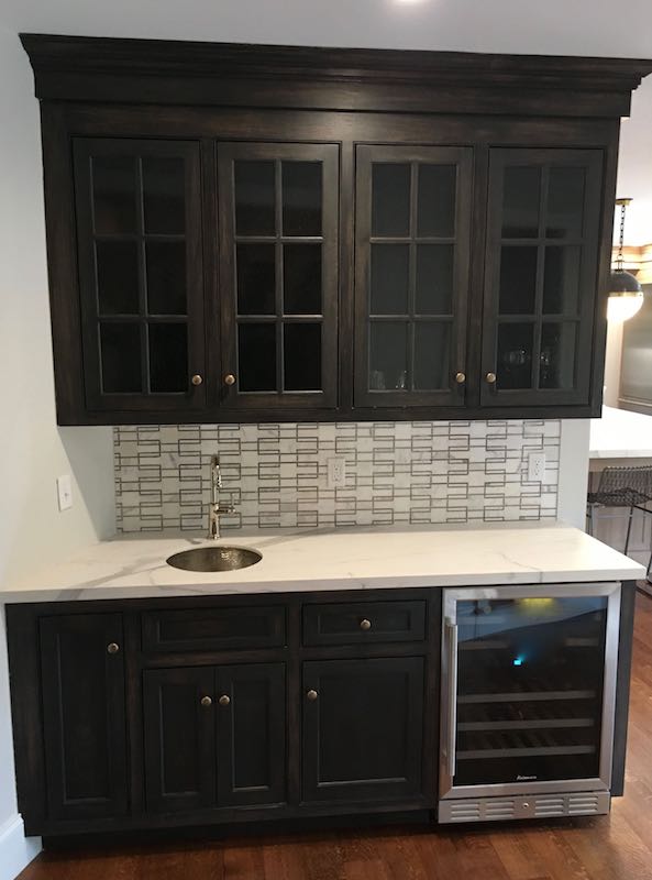
The first example is a small wet-bar nook in a beautifully renovated kitchen in Dover, MA. Most of the kitchen is light and airy, and the designer wanted the cabinets of the wet bar to stand apart - playing the role of a custom piece of furniture. To create a contrast with the clean design of the rest of the space, we wanted more drama and texture for this piece and settled on using black with a hand-rubbed look.
The cabinets were custom-made, so I had the benefit of working with unfinished wood. To create this finish, I used watered-down black chalk paint that acts like a stain by sinking into the wood, but still has more opacity than a stain to give variation in the amount of grain that shows through the finish. After the paint dried, I lightly sanded the surface to accentuate the hand-rubbed look and to keep the finish smooth. With this complete, I was on to the top coat. To make sure my finish was durable but not too shiny, I opted for 3 coats of a matte-finish polyurethane, which topped off the look beautifully! In describing the end result, my client exclaimed: “it looks like it came straight out of an old English manor!”
The second example is the vanity in a renovated bathroom in Brookline. Similar to the kitchen in Dover, the bathroom has a very clean, modern look – this time with white tiles on the walls and gray octagonal tiles on the floor. To add “pop” to the room, the designer wanted the vanity to be the jewel of the room, planning it in a saturated teal color with a specialty finish.
For the finish, the goal was to create a subtle variation to look like an aged patina. We wanted to give the piece some depth and interest – but avoid making it look too busy or fussy. To accomplish this look, I started by painting the piece in the base teal color using cabinet paint to insure durability. After 2 coats of the paint, I then buffed the finish with fine steel wool to make it was a little less shiny and to create more of a deep luster. With this done, I then applied a darker color of watered-down teal cabinet paint with a foam brush to allow the water to create variation without obvious brush strokes. When this was dry, I then re-applied a second coat - this time with more water - creating more subtlety and depth in the “patina”. In the end, we accomplished out goal – as the homeowner sees the vanity as the highlight of her new space!
Enjoy,
Jason
When it comes to specialty paint finishes, starting with a fun idea can make all the difference! This was definitely the case with my recent project of painting an ombre finish in a large dome ceiling.
The dome is about 30 feet high and 25 feet wide, and features small “star” lights set up in constellations. The existing color was a light sky blue – but to up the drama and impact, my client wanted the dome painted with a fade of colors to look like a twilight sky (definitely more appropriate for the stars!).
The first step was to choose the colors. To make sure the room ended up with a cohesive look, we started by considering the colors of the furniture in the room and then compared these to different color families that would create the feel of an evening sky. To accomplish this goal, we focused on hues that had a little blue, a little purple and a little gray. We also wanted a good range to cover the deep night sky at the top – but varying all the way to a light-ish tone for the color that happens at the horizon just after the sun sets.
We ended up using Benjamin Moore colors “evening sky” (appropriately named!), “blue heron”, “Stratford blue” and “harlequin blue”. I also added a fifth color to the blend by doing a mix of the darkest two. To show what this would look like, I did a sample board to review with my client. They loved it – and I was off to the races!
Of course, before I could go too far, I had to consider how to paint a 360-degree fade while 30 feet in the air. After renting some scaffolding – I was then truly off to the races!! I started at the top, painting 2 coats per color to get good coverage. Once the coats were dry, I then went back in with a third pass re-painting a strip of about 2 feet for both colors where they met. Moving quickly, I then worked the two wet colors together to create the fade. Our goal was to get a transition that was not too harsh from one color to the other – but also to keep some of the variation to keep it looking hand-crafted.
The end result hit the nail on the head and the feeling in the room is truly special!
Below is the before and after --
Enjoy,
Jason
The “before” color with scaffolding in place and ready to go
The final result!
I absolutely love doing mural work, and my full-room mural at St. Andrew’s church in Wellesley was no exception!
The room I was asked to help transform is a classroom for 5th graders, and the process began in this room collaborating with the St. Andrew’s team spearheading the project. As we looked at the off-white walls, it was exciting to imagine where we could take it!
The high-level vision was to create the feel of a middle-eastern desert. The idea was to depict a scene that could come from the bible, but was not necessarily a strict illustration of any one story. We wanted to leave the experience open to the creativity and interpretation of the children and teachers in the room. Rounding out this experience, the St. Andrew’s team plans to add touches like lighting, a rug and pillows that would look at home in the scene!
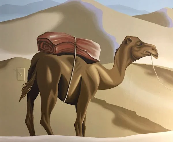
As we discussed more specific ideas for the space, we bounced around possible elements like camels, covered litters, buildings, a caravan, and a nativity star. The goal was to create a bright, inviting space that would help create a fun and engaging education experience.
The more we talked through the goals, the more we were able to narrow down our collective vision. One outcome was the decision to keep the feeling of the mural on the “quiet” side – giving just enough imagery to capture kids’ imagination without too much clutter. Another discussion we had was to make the image inclusive and leave the story open to interpretation. Along these lines, we wanted any representation of people to be something that would be relatable to boys and girls of any race.
With all of this information in hand, I was off to the design process! As usual, I started with a scale painting – in this case for the “feature” wall of the mural (below).
Concept sketch for “wall1”
Including the nativity star was important, but as we discussed, we didn’t want it to be specifically about the three wise men. I wanted it to feel like anyone could be the leader of the caravan, or could join on the journey. One of the St. Andrew’s team commented about how appropriate it was to have it be just one person – as ultimately everyone has to follow their own spiritual journey. I also wanted to use enough color (particularly with the distant dunes in blues and purples) to keep it bright and interesting while still reading as a desert.
The team loved the concept and I was on to designing the rest of the room! In designing the dunes, I wanted to create the feeling with depth within each wall, but also the feeling of a vast continuous space as the mural wrapped around all of the walls.
To round out the feel of the desert and add some visual interest, I included a palm tree and a cactus. Here, I did some research to make sure my scene was somewhat accurate and I found out that the prickly pear cactus is what one would see in the middle east!
I also wanted to add things to discover and delight. Adding animals helps support the desert theme, but also adds to the fun and hopefully helps with the stories that can be created! Again, I did some research and found a desert hedgehog, a pin-tailed sandgrouse and a Sinai agama lizard that would be native to this area. Of course, adding these elements also made it more fun to paint!!
The St. Andrew’s team is thrilled with the final result, and I can’t wait to hear how the 5th graders feel about their new space!!
The focal point of the mural
“Wall 1”
Camel detail
“Wall 2”
Palm tree detail
Pin-tailed sandgrouse detail
Desert hedgehog detail
Mural wrapping around corners
Long shot of back wall
Back wall
Prickly pear cactus detail
Pin-tailed sandgrouse #2 detail
Sinai Agam lizard detail
Most of the work I do- whether a mural, decorative finish or commissioned portrait tends to be done with paint – so it was fun to do this recent project in pencil!
I met my client John while on another job doing a specialty paint finish on some cabinets. When John learned that I did portraits, he instantly got the idea to have me create a gift for his wife.
John’s wife had a special relationship with her grandparents, but there unfortunately were not enough pictures of them for her to have one. Knowing this, and knowing that his wife loves pencil drawings – John asked me to do a pencil drawing of the grandparents as a special gift for his wife.
To make this happen, John was able to covertly get me a photo to work from. With this in hand, I was on to doing the drawing. Below is the photograph I worked from:
John was thrilled when I delivered the drawing (below), and is excited to give it to his wife!
Enjoy!
Jason
I don’t know if creative projects are like kids – where you are not supposed to pick favorites – but I have to say that this full-room mural is my favorite to date!
As the Wellesley Free Library was planning the renovation of their Fells Branch Library, I was fortunate to get a call to join the process. The Fells Library is a smaller facility, and they wanted to focus on the primary audience of young children (ages 0-6) in their design. The library team began their process with architects Johnson Roberts Associates, and settled on a theme that incorporated scenes from the town of Wellesley. The plan called for the tops of the bookshelves to be built out to look like buildings in the town and for the walls to be painted as a nature scene backdrop.
While the concept was decided upon before I was involved, the process of realizing the plan was extremely collaborative (and fun!). From choices of colors to details in the buildings to the content of my murals, there was input from the library team, the architect, the carpenter (Sean Reidy of Charles River Custom Carpentry), the painter and me.
After the planning stage, my first involvement was working with Sean (who happens to be my brother-in-law!) on the fantastic 3-D trees that jut into the space. Johnson Roberts called for this in their plans, so Sean’s first step was to block out the positioning of the trees with rectangular plywood that delineated how far out and low down the branches could go and be within code. I then got on my ladder to draw out the trees so Sean could follow my drawings for the final cutouts.
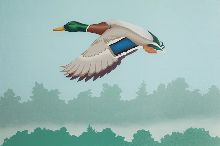
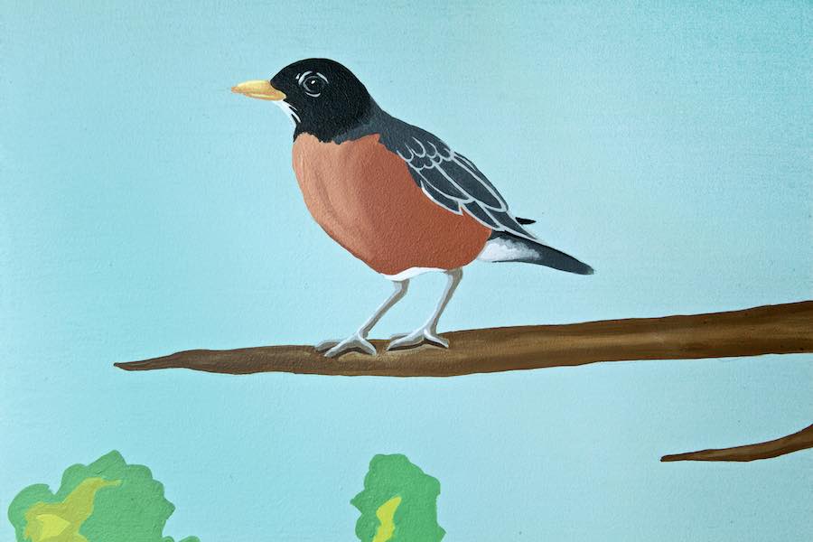
While Sean then went to work on the buildings and the painter painted and prepped the walls, I was on to designing my murals. The direction I was given was pretty loose – leaving most of the decisions up to me. I knew we wanted nature scenes to back up the town buildings, and one wall needed to incorporate a lamppost (to go with the lamp sconce light) as well as a representation of the “Entering Wellesley” sign. To make sure my scenes were tied to the town, I asked for recognizable places and then went out hiking with my camera. A few of the places that made it into my final paintings were Boulder Brook path, Morses Pond and the town green near the Post Office. For the birds and animals, my goal was to make sure that I used native animals that the kids could see in their backyards. The only specific request I had was to include a goose near the town hall building (where there is a constant presence of geese!).
Another decision I needed to make was the look/style of how this would all be painted. While the audience is small children, I wanted the murals to be timeless – in terms of both the relevance ten years (and more!) from now, but also the ability of my murals to appeal to people of all ages. While I wanted the overall look to be clean and bright, I also did not want it to be cartoony at all – instead choosing to do just enough detail to make it realistic while keeping it simple enough to appeal to kids. When it was complete, one of my favorite comments I heard was that it was “child-friendly without being childish”.
With all of this in mind, I started doing my designs – which are scale paintings done in the actual paints that would be used on the walls to give an accurate representation of what the final product would look like. I submitted these to the library team and they loved them – just saying “go!”. Here are pictures of a few of my designs.
With the design direction approved, I was on to painting the walls. I started on the side with no buildings, focusing more on nature – including the Boulder Brook Path shown here:
On this side of the room, I also had the 3-D trees I painted to look like bark and incorporated them into my mural:
Also on this side of the room is where I represented Morses pond. I wanted to get a sense of the distant shore and reflections in the water higher in the mural, but also wanted to get the beaver right down at small child height:
As a transition to the “town” side of the room, I did the town green with the lamppost and sign. Of course, the sign is not actually in this location, but I needed to take some creative liberty to include both elements in this section of wall:
As the theme transitioned to buildings, my focus shifted more to being the background with trees and birds – but I still found a couple of opportunities for other animals – including a mouse that is also right at child height:
As I was painting this, several tours came through and I had the opportunity to hear people’s reactions. Some of my favorites were how the space was “magical” and “inviting” – but I think my favorite was “I want to live here!”
After 5 weeks on-site, I was done with my largest mural project yet! I enjoyed every step of the way – and I was even a little sad to leave on the last day of painting…
Below are some more pictures of the space – Enjoy!!
Enjoy!
Jason
One of my favorite compliments I have received was from a client who, when looking through my website, said “wow, so you can paint anything ?!” While this is a bit of an overstatement on my skills, I do enjoy the challenge of painting many different subjects – including a new first with my latest project.
About a year ago, my client David travelled to Eastern Europe with his family, where they discovered their family crest painted on a shield. To bring their discovery home with them, they took a number of snapshots – but David had bigger ideas. Fast-forward to this holiday season, and David put his plan into action by reaching out to me to do an 18”x24” oil painting of this crest. The main reason for the painting was to create a special gift for his sister, but David loved the idea of having a painting as well – so he had me to 2 identical 18”x24” paintings! Below are the pictures I had to work from:
Working from David’s snapshots, I set to work. My first step was to do a drawing to show David what I planned on painting – essentially the same as the photos, but editing the text to just their last name and making the rendering of certain details like the hands more accurate (I couldn’t resist!). Below is the drawing:
With David’s approval of the drawing – I was on to the canvases with paint! To make sure the 2 paintings were nearly identical, I worked on both canvases at the same time and switched back and forth. For example, when I had the background colors mixed, I painted on background and then painted the other with the same paint to make sure all of the colors were exact from one canvas to the other.
It was a fun project to paint, as well as a fun one to deliver! David was thrilled with the results and is looking forward to presenting his sister with this special gift!
Enjoy,
Jason
My client Julia recently moved into a new home and has been in the process of updating the look of the interior. The result of her upgrades created a bright, clean open area in which the kitchen, dining area and living room flow together in one space. Julia’s color choices nicely compliment the openness of the space, with neutral grey walls, warmer and lighter grey accents, white trim and dark brown wood.
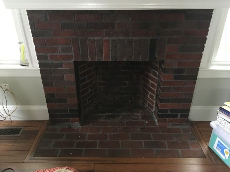
While all of this works beautifully, the dated, dark and soiled bricks of her fireplace looked out of place and immediately drew attention.
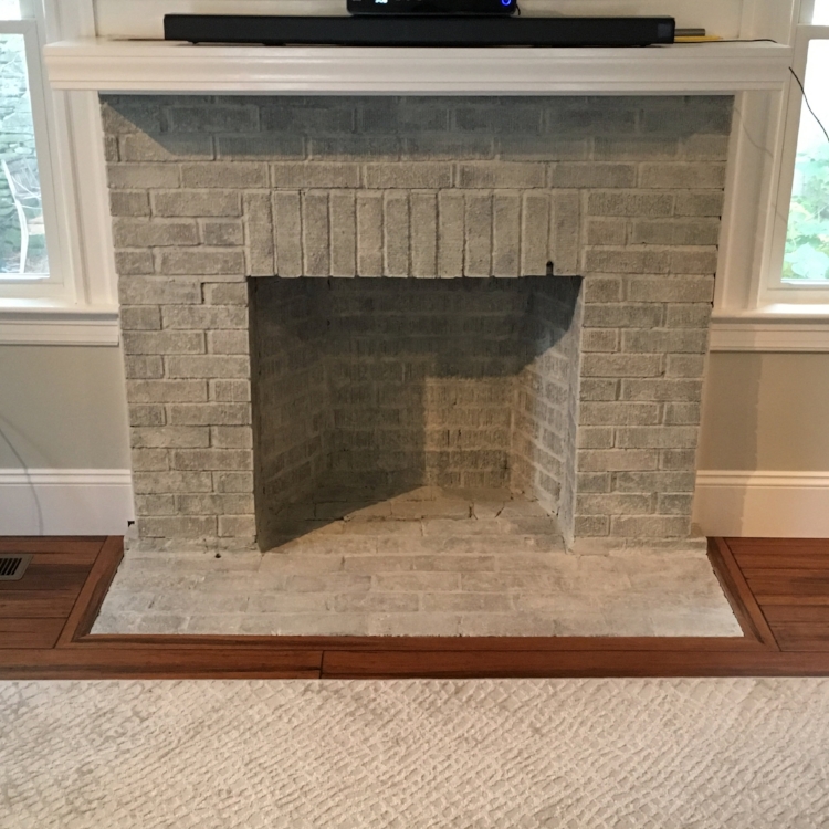
To address this, Julia and her designer came up with the idea of whitewashing the brick using a light, warm grey to tie it in with the rest of the room. Doing a wash instead of painting the fireplace helps maintain some of the character and color variance of the brick to keep the look interesting while still helping it to blend with the space.
With this decided – I was on to making it happen!
Since the fireplace is no longer active, I was able to address the firebox as well as the hearth for a consistent look to the entire fireplace. After looking at different examples with Julia, we decided on a more opaque approach to cover up the bricks more than letting them show through – but still keeping it transparent enough to show the variation of the brick. To make this happen, I experimented with different paint-to-water ratios until I got it just right for the desired effect.
With the project done, the fireplace now blends perfectly with the room while still maintaining some of the character and interest of the brick. Most importantly, Julia “love love loves” it!!
Below is a before and after -
Enjoy,
Jason
The fireplace before…
and after!
I love being a part of my client’s plans to do something special for someone else! This was the case recently when I was contacted by a Realtor who was interested in having me do a painting of her client’s home that she could give as a special thank-you gift. When we first spoke, my client Maryann knew that her client would love a painting of their home, but she wasn’t sure what medium or size would be best. She knew she didn’t want something as formal as an oil painting, but wasn’t sure that a watercolor fit the bill either. Maryann mentioned perhaps doing a pen-and-ink drawing, but asked for my thoughts.
When I asked about the pen-and-ink idea, Maryann said she liked the “clean” look of this – so that gave me great direction. To help make sure the final piece represented the house, I recommended using black and white watercolor along with the pen and ink to help define the contrast of the black shutters and surrounding trees without creating too “busy” a look with the cross-hatching I would otherwise need to define areas with more value. Maryann loved this idea, so we just needed to figure out the size and the image I would use.
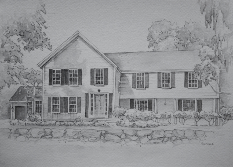
For the size, Maryann wanted something large enough to be able to see details of the house, but also small enough to make it easy to find a place to hang it. Using standard sizes (which makes it easy to find a frame!), I recommended either 9”x12” or 11”x14” to address these goals – and we decided 11x14 would work perfectly. For the picture, since Maryann is the Realtor for the house, I had plenty of great shots to choose from! I ultimately selected the image below because it shows that major features of the house while also having some interest and mood with the slight angle, great sunlight/shadows and the beautiful scenery of the surrounding trees and rock wall.
With all of this decided, I was off to drawing! The biggest challenge in drawing a house is to get all of the proportions correct, which was my initial focus. With my pencil drawing laid out, I then wanted to create a simple, clean look with the watercolor and ink that would represent the house but not look too much like a technical rendering.
Below is the final drawing – which I am happy to report Maryann was thrilled with!
Enjoy,
Jason
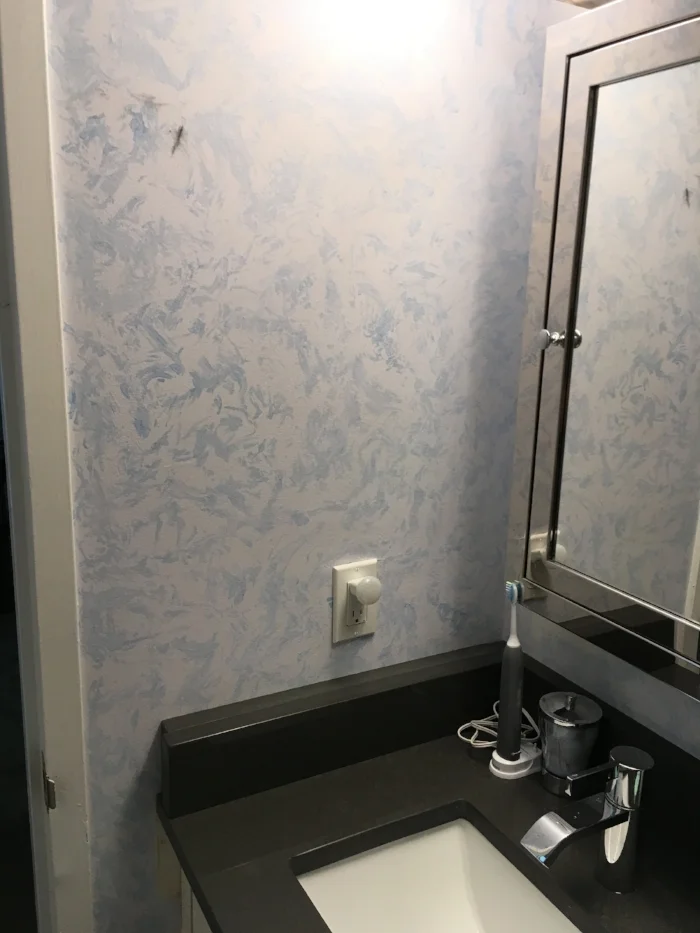
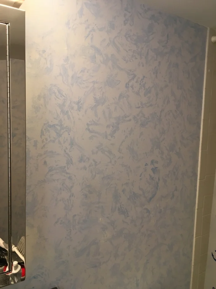
When I first met with my recent client Rose, she wasn’t completely certain what kind of paint finish she wanted in her recently remodeled bathrooms, but she knew she wanted something distinctive to add flair to the relatively small spaces.
Both bathrooms were previously faux painted with a ragged technique, but the colors no longer worked with Rose’s new tile and vanities and the style looked a little outdated next to the more contemporary choices she made for the cabinetry, counter and sink. To address this, she knew she wanted an updated decorative painting finish using gray as the main color.
Working with Rose, we looked at multiple grays and a selection of faux finishes. After looking at some of my previous work and the new tile in the bathrooms, Rose decided she wanted something that picked up on the texture of the tile and liked some of the “concrete-look” finishes I had done.
To make sure we had everything dialed in just right, my next step was to do some test boards showing this finish in some of the color options Rose liked. After looking through the options, Rose made her selection and I was ready to move forward with the project!
Since the rooms were small, it only took me a couple of days to make the transformation complete – and Rose was thrilled with the result! Below are pictures showing the bathroom before and after this decorative painting project.
Enjoy,
Jason
Bathroom 1 before
Bathroom 1 after
Bathroom 1 before
Bathroom 1 after
Bathroom 2 before
Bathroom 2 after
Bathroom 2 before
Bathroom 2 after
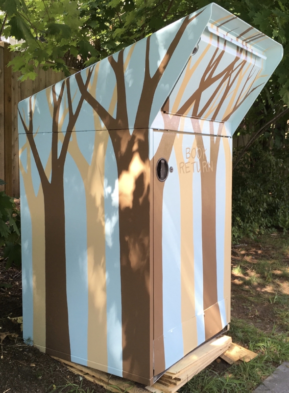
Typically when you think of a “mural”, you think of something painted on a wall – but this recent project is an example of how a mural can liven up just about any surface!
As the first step of the murals I am doing for the Wellesley Free Library Fells Branch, they had me spruce up the book return box to hint at what is coming on the inside of the library.
In addition to including buildings of Wellesley, the mural will have a nature theme, including some cut-out silhouettes of leafless trees. To make a bold but appealing design for the box, I decided to pick up on this theme, using the same colors that will be used inside. My goal was to make the shapes organic and natural, while also keeping the overall design clean and graphical – with the trees almost making stripes. I also wanted to make sure the final piece would be an eye-catcher from any angle!
Below are some before and after shots of the box showing the different angles.
Enjoy,
Jason
Before
Before
After
Back and top of box
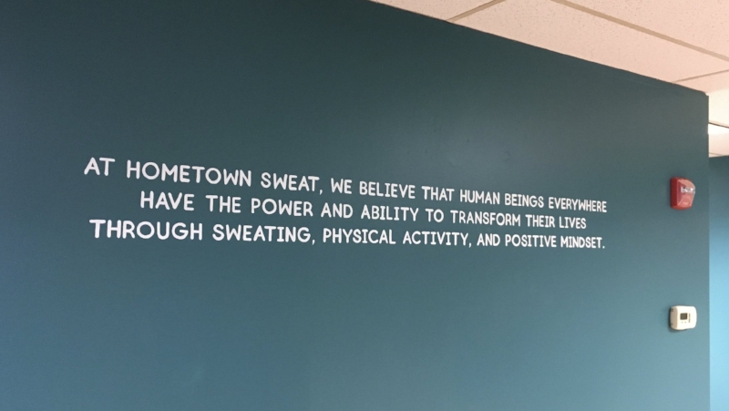
As part of a re-brand and facelift for her yoga studio, my recent client Maria decided to use murals and hand-painted lettering add a special touch to her “new” space!
Formerly known as Bikram Yoga Natick, Maria’s 8-year-old business has grown and her offering has expanded, so she needed her name to better reflect what her studio is all about today. In addition to the name, she also wanted the look of her space to better reflect the fun and casual mood that is part of the experience she has created.
With the name “Hometown Sweat” chosen and a fantastic logo designed, Maria then worked with interior designer Lysa Wilkins to come up with a color scheme and the extra touches they would bring me in for.
First, Maria wanted me to paint her new logo on the half-wall under the front desk to really set the stage for clients as they first walk in the door. For the color scheme, we decided to use the color of the surrounding lobby walls and trim for the lettering and sweat drop to really tie the look of the space together. The background behind the logo is then the same as the workout room that you can see through windows behind the desk
To share the inspiration behind the studio and bolster the meaning behind the re-brand, Maria then wanted me to paint her vision statement on a main lobby wall that everyone will see before entering the actual workout room. While there is certainly serious intent behind the vision, we chose a font that would add a light-hearted feel while also tying in with the logo.
Finally, on a wall near the changing rooms, Maria had a vision for a big, colorful sweat drop that would be unique, memorable and fun. For this, I decided to incorporate a lighter version of the green from the walls as well as purple to tie in to the adjacent women’s changing room. As a fun detail touch, I made the reflections on the drop match the shape and pattern of the lights above (as if it were actually reflecting!)
It was fun to see this all coming together and to share in Maria’s incredible excitement!
Enjoy,
Jason
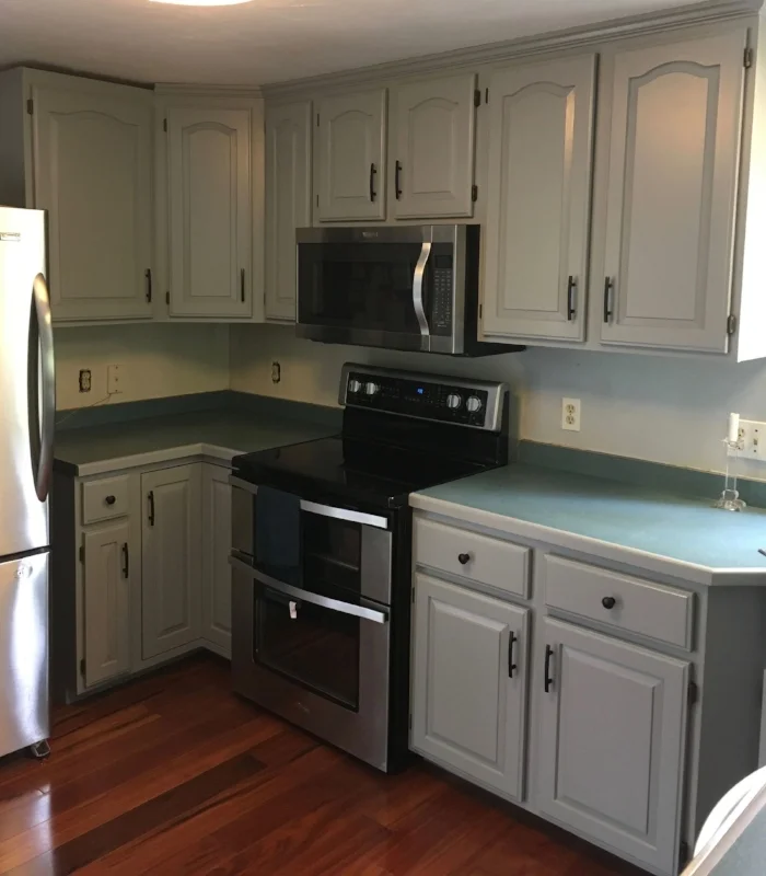
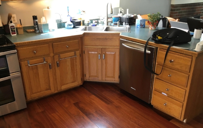
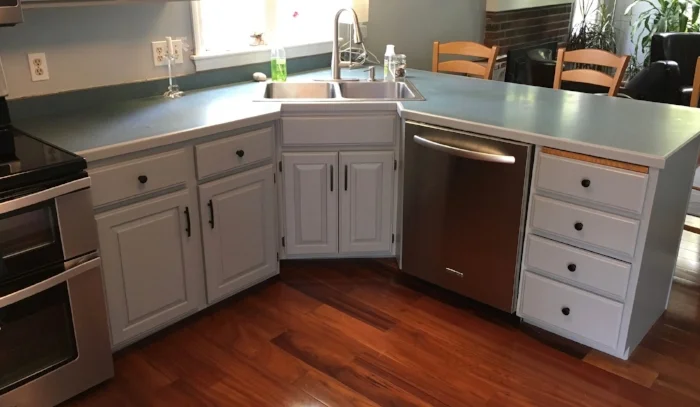
Sometimes my painted cabinet work is part of a larger kitchen re-hab, but as with this recent project – sometimes painting the cabinets IS the re-hab!
My clients Terry and Mariana didn’t love their tired oak cabinets, but ripping them out and re-doing their kitchen just wasn’t a priority! Rather than dealing with the time, cost and upheaval associated with remodeling, they called me to see if painting the cabinets would give them the face-lift they were looking for.
When I visited, I saw that the cabinets were in decent shape and a good candidate for painting – so we were on to a discussion of color. Outside of the cabinets themselves, Terry and Mariana’s décor is modern and clean, with grays, black and deep brown. We discussed going with white, but we ultimately felt this would look out of place and would accentuate the green counter-top. Instead, we decided to go with a nice neutral gray to flow nicely with the adjacent spaces and work with the counter color.
From there, I was on to my normal process. I removed the cabinet doors to work on back at my studio and proceeded to scrub and sand the cabinet frames to prepare them for a bonding primer to insure the paint would adhere. With the primer applied, it was on to another round of sanding and the first coat of the cabinet paint. After this dried overnight, I did a last round of sanding and applied a second coat of the cabinet paint for the final finish.
With this complete, I was back to my studio to do the same process with the doors. After about a week, I returned to re-install the doors and the new hardware Terry and Mariana had chosen. The “new” cabinets made a huge difference!
Most importantly, Terry and Mariana are enjoying their “new” kitchen!
Below are some pictures showing the before and after of this project
Enjoy,
Jason
Before
After
Before
After
Before
After
I just finished my largest commissioned painting yet! At 4 feet square, this landscape was commissioned to celebrate the 10-year anniversary of my clients Monique and Eric.
When Monique reached out to me, she mentioned that she has been looking at my work on Facebook and was waiting for the opportunity to have me do a piece for their home. With their anniversary coming up, she and Eric decided now was that opportunity!
Monique and Eric were married at Mirror Lake in Lake Placid, New York and wanted the painting to be about this special spot. Monique shared several pictures of the vista across the lake, but they also wanted to add some details in the foreground that were not in their pictures. First, Monique and Eric love to paddle and wanted a kayak in the scene as that is how they most enjoy experiencing the lake. Second, Monique liked being able to see rocks through the water in some of my fine art paintings (particularly “Twilight”) and wanted to include this as well. Since I love to paint the view through water and I am avid paddler myself – this was all music to my ears!
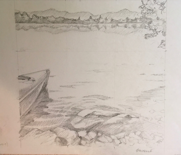
To start the collaboration process on how the final image would be compiled, I set out in my own kayak on a local lake to take some pictures. Spending the first few hours of my “work” day paddling and taking pictures is about as good as it gets!! When I got back to my studio, I did sketches showing how some of my photos would look as options for a foreground to combine with the background of Mirror Lake from their photos. Below is the Mirror lake image we chose – and following that are my sketches together with the corresponding foreground photos.
Monique and Eric's picture of Mirror Lake
Foreground option 1
Sketch for option 1
Foreground option 2
Sketch for option 2
Foreground option 3
Sketch for option 3
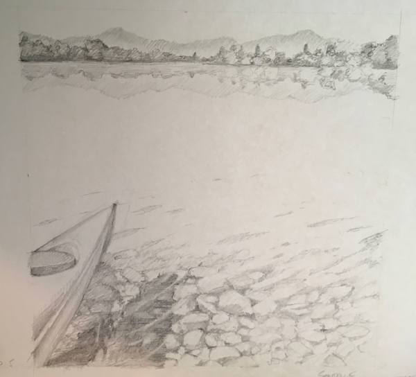
I met with Monique and Eric to review the options and all the photos, and we pretty quickly settled on the first option. With this done, my next step was to do a small “sketch version of the painting before moving on the final big painting to make sure I was capturing everything they wanted. Below is a picture of the 10”x10” “sketch” painting:
10"x10" "sketch" painting
Once this was done, we met again to review the painting and Monique and Eric were happy with the direction I was heading for their special piece! With their approval, I was on to painting the final work.
I thoroughly enjoyed painting this. Working with water is right up my alley, but it was also fun to do some things that I don’t do as often, like the distant trees and mountains. Most importantly, when I delivered it, Monique and Eric were thrilled with the result!!
Enjoy, Jason
The final painting!
In addition to some of my larger projects, I also enjoy when I get requests from my contractor, painter and interior designer friends to do unique paint repairs that tap into my color (and pattern) matching abilities.
I have done a few of these “paint fixes” recently that are good examples of the range of different things that can be done with paint to make problems disappear!
The first example was at a home up in Reading, MA. In this case, one of my interior designer colleagues reached out to see if I could paint over patched holes in a stairwell to make them blend with the walls around them. The challenge here is that the stairwell was painted with a faux finish, using multiple colors that were not recorded! Re-painting the stairwell was not a great option, as it is continuous with the kitchen and great room – all of which have the same faux finish. So matching the faux finish was the only way to go! To do this, I made a first visit with my paint swatch books to find the colors that most closely matched what was used originally. This is always a challenge, because with a faux finish, one or more of the colors is diluted with a glaze medium, so I have to deduce what the color would be if it were at 100% concentration.
Once I had this information, I gathered the paint and headed back to take care of the job. I always bring a range of colors similar to what I spec’d, because I find that I almost always have to do some mixing to get an exact match – which was definitely the case with this project! There were 3 holes – but the one pictured was the largest. When I was done, the homeowner couldn’t find the damaged spots – which is always the best compliment I can get for this kind of work!
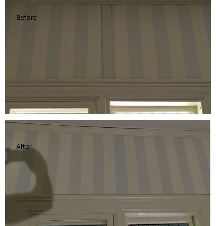
The second example was at a home on Brookline, MA. In this case, water leaks stained two different sections of wallpaper. Neither paper was still available to do replace the damaged section, so the contractor called me in to paint over the damaged sections and make them blend with the existing paper!
Like with the faux repair, my first step was to visit the home and see what colors would match the wallpaper. Again, I returned with multiple colors to make sure I could mix if needed to get an exact match.
After cleaning and priming the stained spots, I was on to my color match. For the striped paper, my cream-color paint was perfect with no mixing! The blue took a little mixing, but I was also able to get that to blend with the existing blue. Some of the stripes I completely re-painted, while with others, I just painted along the trim where the staining happened. The grass paper was a little trickier! The color I chose was great as the “base” color, but I also needed to mix a lighter and darker version to re-create the subtle streaking that happens in the fibers of the grass paper. Below are before and after pictures of these 2 fixes. In both set of pictures, I needed more light at the end of the day – so the “after” pictures look brighter, but that is just the lighting!
The last example is a small and subtle one – but it was a lot of fun. After doing some wall repairs as part of a kitchen re-model, a painter had filled gaps where the brick of a chimney met the wall. The only problem was that the bright white of the caulk really stood out next to the brick, which the contractor and homeowner were not happy with. To fix this one, I was called in to paint the caulk to look like the grout of the bricks. For this, I needed to match the many different colors in the grout and re-create the dappled look of the concrete. When I was done, the homeowner no longer knew where the patches were! Below is a before and after of this.
Enjoy,
Jason
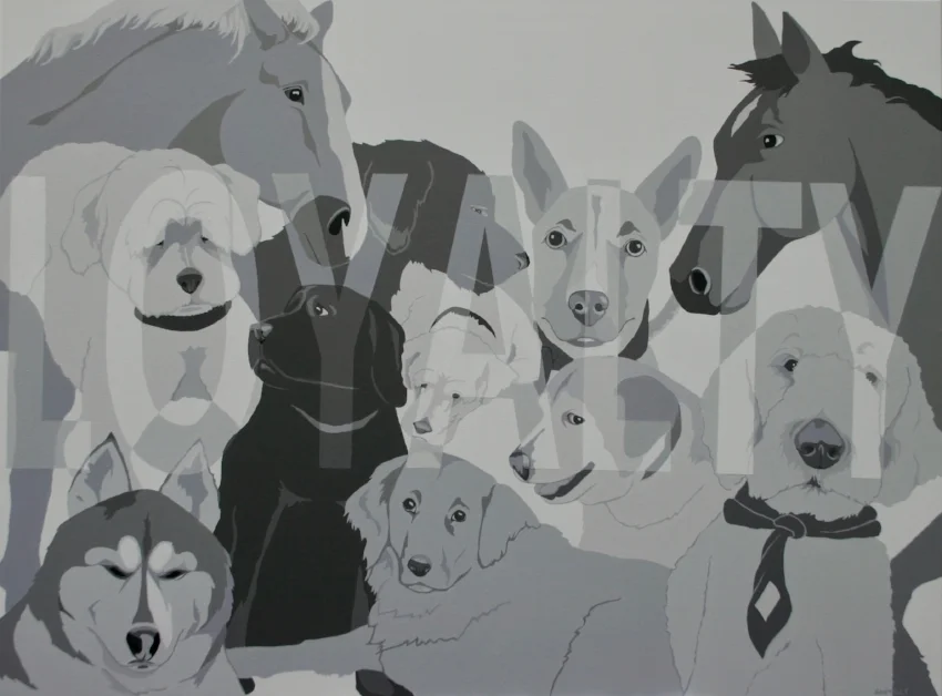
So, how do you take the word “loyalty” and combine it with images of 9 dogs and 2 horses to create a clean, bold mural panel? That is exactly the (fun!) challenge I was recently presented with!!
Working with artist agent Linda Sbrogna of Sbrogna’s Artistic Promotions, I went to visit my past client Debbie Seaman at Seaman Engineering in Millbury, MA. For those who have been following my blog for a while, you may remember the collage mural panels I did using elements representing Seaman’s business of engineering for HVAC, plumbing and fire protection services. Their business has since moved, and they are now in a fantastic new space that is a converted mill, with high ceilings and exposed brick and concrete. My previous pieces are up in the new space and go perfectly in their conference room and work area.
As Debbie toured me and Linda through the office, we stopped and talked for a while in a room they set aside as an employee kitchen and lounge with clean light gray walls, modern black tables and industrial steel chairs. Here, Debbie talked about how she wanted something special for this employee space, but she was not sure exactly what. I suggested working with simple, clean designs in grays, white and black to go with the look of the room and keep with basic design ideas of the other mural panels.
With that, Debbie quickly came up with the idea of using this design concept to represent the pets of her employees. The team at Seaman has been together for a long time, and Debbie loved the idea of honoring her employee’s loyalty by bringing images of the pets they love into their lounge space. As we talked through the idea, Debbie also liked the idea of integrating the word “loyalty” to play off of her employee’s loyalty to the company, the company’s loyalty to the employees – and of course the loyalty of the pets! We settled on a size of 3 feet high by 4 feet wide on a panel to give them flexibility with hanging (and potentially moving!) it.
With this idea rolling, Debbie had each employee send her pictures of their pets for the special surprise. As the pictures rolled in, I put together a scale design (below) and brought it up to Seaman for Debbie to review. Debbie loved the design, but to be sure everyone was happy with how their pets looked – we also took the design around the shop for everyone to see – and happily, the whole group was pleased!
The initial concept "sketch"
Once I knew we were on the right path, I was on to painting the final panel. I use the design as my basic guide, but with the larger scale, I can also add a little more detail. This was also a great opportunity to update one of the dogs with a better picture.
Below is a picture of the final 3’x4’ panel. It was a pleasure to work again with Debbie and the Seaman team as well as Linda Sbrogna – and best of all, the entire team at Seaman is thrilled with the final result!
Enjoy,
Jason
The final mural panel
A Boston-area online Magazine highlighting the people of the area has published an article about BlackBeak Studios! I am thrilled to be included in Boston Voyager Magazine which focuses on sharing "Boston's Most Inspiring Stories".
Here is a link to the story: http://bostonvoyager.com/interview/meet-jason-sawtelle-blackbeak-studios-metrowest/
Enjoy!
One of my interior design partners recently called me with a fun challenge. Her clients had purchased a large armoire and they loved the piece – but unfortunately, the color was not working well with the room. The armoire sits next to a beautiful old light-wood dining table in a white room, and the clients wanted a pop of color to prevent the armoire from blending in with the table and to pull out some of the color accents in the room.
Knowing her clients well, the designer suggested a “washed color” look in different blues to accomplish these goals. After talking a bit about the look she wanted to accomplish and looking at some inspiration photos, I had a good sense of what we were shooting for.
My first step was to paint some concept boards – showing 3 different options from light to dark. When doing custom finishes, this step is key to making sure everyone is happy with the final result. This is also one of my favorite parts of the process because it is where I get to figure out how to translate the client’s vision into something that can be accomplished with paint! In this case, all of the options were painted a base color, then “washed” with a lighter color that is thinned down with water. When this dried, I then did a light sand of the entire surface to soften the streakiness of the wash.
The designer and client were thrilled with all of the samples and ultimately chose the lightest option. With this choice made, it was on to painting the piece!
As with my cabinet jobs, once I was on-site, the first step was to prepare the surface. The key here is that paint won’t stick to shiny surfaces – so the existing finish needs to be dulled. With this done, I moved on to painting the base color of a light grayish blue. Once the base coat dried, I applied the wash of a slightly darker, greener blue-gray to create the streaky look. Finally, as with the board – I did a light sand of the entire surface to give it a soft, smooth look.
In the end, thanks to the input from the designer and client, the armoire looks perfect in the room! Most importantly, they are thrilled with the armoire and the completely new impact it has on the space.
I forgot to take “before” pictures of this project – but below are some of “after” shots along with the manufacturer’s pictures of what it used to look like.
Enjoy,
Jason
The armoire with the dining table in front
What it looked like before!
Similar to the work I have done painting kitchen cabinets, painting old bathroom vanities is a great way to make the cabinets look new and customize them to your tastes!
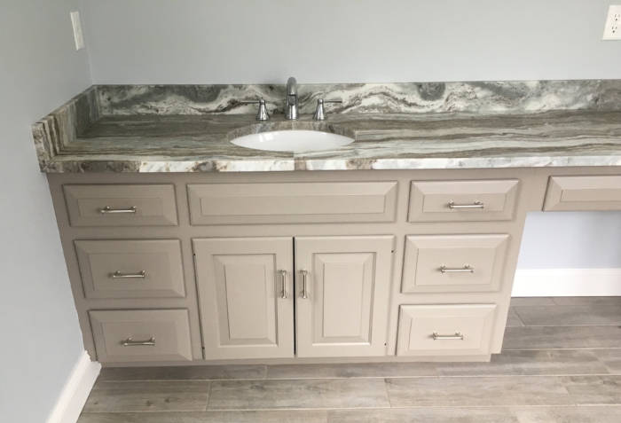
My client Charlene called me in to help with her bathrooms as part of a refresh she was doing to put her house on the market. Since the vanities in her 2 upstairs bathrooms were high-quality wood (and in good shape!), Charlene knew she could save some money and get the benefits of customizing the color by having me paint them.
The first step was collaborating with Charlene on color. She wanted both of the bathrooms to look fresh and modern, but she is not a fan of white cabinetry. Of course, she knew the house was going on the market, so the color also needed to be somewhat neutral. To address these concerns and also tie in to Charlene’s other décor decisions, we went with a taupe for the master bath and a light, warm grey for the second bath.
With these decisions made, I was on to my usual process of disassembling, scrubbing, sanding, priming, sanding, painting, sanding (again!) and finishing with the final coat of paint. All of this scrubbing and sanding is essential in making sure the paint sticks and is durable – while also creating a nice even finish.
When I had everything reassembled, Charlene and her husband were thrilled with the results! Here are some before and after shots.
Enjoy,
Jason
Master bath before (right half)
After
Master bath before (left side)
Master bath after
Guest bath before
Guest bath after